My students and regular readers will likely remember that I am a fan of Alistair Cockburn's work. His book on software development is one of the best I've ever read, and I have been reading his blog for years. Earlier this week, he linked to a video in which he was interviewed by the organizers of 1st Conference in Melbourne. The conference has refocused to emphasize Cockburn's latest conceptual model of agility, the Heart of Agile.
I listened to the interview while doing some painting, and a few things stuck out to me that I want to remember. First and perhaps trivially, Cockburn explains that he lives in different places for a few months at a time, traveling the world with two backpacks and a suitcase that contain his possessions. He travels the world like an old-world bard, sharing stories that he has heard along the way. I don't know that this is relevant to my teaching and professional practice, but it is interesting. I do believe that such a lifestyle would give someone a very different perspective on what the prevailing culture assumes to be true.
All the discussion of Heart of Agile makes me think that perhaps this is something I should introduce in my Spring courses, particularly the game production studio course. I have become an advocate of inspirational posters that are tied to team identity, things like having the vision statement or Sprint theme posted publicly so that we can look up and see it. Perhaps I can post something like this canonical representation of Heart of Agile in the studio space and see how students react.
There's a short discussion in the interview where Cockburn talks about how this model is not designed specifically for software development but for organizations in general. He hypothesizes that it was discovered in software development because we have a particularly keen understanding of what "deliver" means, but he goes on to explain how this model is being used also by NGOs. During this part of the interview, I kept thinking, "What if the university adopted this idea?" Cockburn points out that it always starts with micro-steps. I am not sure even what micro-steps the university could take, but that would have to be the topic of another essay. Actually, watching a part of the video again, I do know what it would be, since he talked specifically about what a big organization can do: center its budget upon improving collaboration. I think it's pretty clear that we don't do that at the university, and I wonder what it would look like.
Around the 25-minute mark, when asked what a good starting spot is for an organization, Cockburn describes an exercise focused on improving collaboration. As he discussed it, I had visions of running this exercise with student teams, either in the studio or in a class like CS222, where teams inevitably have to deal with the real problems of failed collaboration attempts. The exercise involves each person drawing a diagram of all the people they have to collaborate with to get something shipped. Mark each collaboration as whether it needs to be weak, medium, or strong, and label each one with the current quality of the collaboration on a 1–10 scale. Finally, pick out the two collaborations that you consider the most important, and name one thing that you personally can do to improve that collaboration. A second step would be to write two or three stories for each collaboration about a time that it has worked well; this leverages the idea that if we look for good, we can create more good. I can see both of these being valuable for the kinds of student projects I mentor, even though their collaborative networks may be a bit small. Their version of "deliver" is a bit different from an industrial sense, but as Cockburn says, the Heart of Agile should apply anyway.
The final element of the conversation that jumped out at my was the discussion of host-leadership. This was not a phrase I had heard before, and Cockburn praised the interviewer for his reference to it. Cockburn makes the claim that , "'Servant-leader' is an outmoded term that is not serving the purpose anymore." This surprised me, since I feel like I generally understand the concept of servant-leadership and have found it a useful metaphor. Host-leadership uses the metaphor of host, and the movement seems to be grounded in the book, Host: Six New Roles of Engagement. I have not read the book, but I came across this summary of the six roles, written by the book's co-author. The roles are Initiator, Inviter, Space Creator, Gatekeeper, Connector, and Co-Participator. Nothing about the description struck me as particularly novel, and I admit I have not searched for empirical evidence to support any of the claims in either model. I am left having to acknowledge Cockburn's vast experience in visiting many different organizations in many different places, and that he must be seeing dysfunctional organizations that need new metaphors. The space of my experience is so tightly limited to the classes and courses I myself control, I know that my perspective is myopic. Even the whole "Agile is Dead" meme—with the word "agile" being entirely co-opted for profit, and causing the necessity of finding the real heart again—is not something I personally experience, but only something I vicariously experience through readings, interviews, and discussions. Reading about host-leadership is not something high on my list of priorities, as I've become more interested in concepts of safety as expressed most concretely in Anzeneering. Still, I will have to keep my ear to the ground and talk to my network of friends and alumni in industry to hear how these ideas resonate.
I had a great time in my Honors Colloquium on Serious Game Design this past semester. I consider myself very fortunate to be able to teach this course. It is not part of my usual load, but I have received internal grants that give me the course release from regular Computer Science courses. This is possible because I tie the game design course to my immersive learning work: our study of serious game design is framed around a community partner's needs, and the students' learning manifests in playable prototypes that are delivered to the partner. The best ideas from the Fall become inputs into my Spring Game Production Studio course, which is also made possible through the grant and the generosity of my community partners.
The most significant change was that I increased the amount of reading and exercises that students completed prior to beginning their final projects, from about a third of the course to about half of the course. We read the first ten levels of Schreiber's Game Design Concepts, more than I had assigned before, and I also picked out a selection of my other favorite readings, which you can see on the course site. Each of the readings had a corresponding exercise, most involving students creating some artifact that represents their understanding and sharing it with the class.
This portion of the course went well and I was pleased with the amount of student interaction and apparent student learning. One noteworthy story is from the reading of Schreiber Level 8 and completing the homeplay assignment described there, which is to sketch a game design that would appeal to "griefers". I prefer Bartle's "Killers" term, and the fact that the reading drew heavily on Bartle Types is significant here. All of the students—as memory serves—described games that had a similar structure: multiplayer games where you kill or disrupt other players in order to win. When they finished their presentations, I told them that I thought they had all missed the mark: the goal of any competitive game is to beat your opponents, and so if killing or disrupting them is the game's mode of victory, then it's Achievers who are being motivated here, not Killers. This got them thinking and led to a good discussion about how everyone who plays a game has to follow the rules—otherwise they're not playing the game!—but that player types give us a way to think about how players bend or apply the rules to serve their own ends. It may merit mentioning that this is an Honors College course, so all the students in the course are "good students"; that is, they arepredominantly Achievers in the game of education!
We wrapped up the first half of the course on a positive note and moved on to students' pitching their ideas for final projects. One problem that arose here is that students were happy to throw ideas around and comment upon them, but I think they couldn't see the bigger design issues that were at play. If I am able to teach the course again, I should have them pitch based on an actual prototype rather than just ideas, since they suffer from the blindness that defines beginners. I recently listened to an episode of Ludology in which Geoff Engelstein suggests that every game should have a vision statement, and perhaps I should also require something like that. It reminds me of a little story I neglected to tell in my post about Fall's CS222 class, where a team had real trouble focusing their efforts. I suggested they invest time in creating a vision statement, such that they could use it as a sieve for all of their creative ideas. It took longer than they expected, but once they had it, it served them well for the purpose I suggested. For some of them, this was one of the major takeaways of the semester's work.
I already wrote about how students showed a dearth of theory in their final project production work. I ended up keeping the question basically as I had written there, just with minor editorial changes:
Consider the discussions we have been having in class during the pitch and production period (October 17 through November 30) along with the essays you have written above. According to my notes, no student referenced any theories from the first half of the course during this period. Write an essay addressing the question, Why is that?, and What are the implications? To address this, you might consider corresponding questions such as Could it have been otherwise? or What are the relative merits of personal opinion vs. theory?, although there are certainly other directions one could take a thoughtful essay. [6 points]
As one might predict, a majority of the submissions were rather flimsy justifications around the idea that they had internalized the lessons from the first half of the semester and were implicitly drawing upon them. I don't think this really holds any water, and none of them went through the effort of considering reasonable objections to their point: for example, in any humanities course, you wouldn't be expected to get away with not citing the class readings in your final paper. Perhaps I should have reminded them that a good essay has to stand up to obvious criticisms.
However, one submission really blew me away. The student wrote coherently and convincingly about confirmation bias and the dangers it poses to students. He described how the majority of Honors College courses are designed to help students separate themselves from their biases to gain an enlightened view of culture, but that in this course, they had fallen into the trap of doing the minimum required work to get a good grade out of the education machine. He points out specifically that the course is comprised primarily of hobbyist gamers who are programmed into confirmation bias by reading IGN and Metacritic reviews. His essay really grappled with what the question posed without succumbing to generalizations or educational folk tales.
I want to document here a few other potential shortcomings so that I can consider them if I am able to teach the course again. First and foremost, although I provided explicit goals for each status report presentation during the production period, you wouldn't have known it from the student presentations. For example, one of the requirements was to report on the type of playtesting that was performed and how it was influencing you, but many were clearly not doing any playtesting at all. In retrospect, I could have included some kind of tangible submission, such as a completed status report template, to hold students accountable to the process. After all, the course and their grades were supposed to be about the process, and so I should capture artifacts to support that.
Speaking of playtesting, it was late in the semester that I realized we never really talked much about it in class, and that's in part because I had not assigned any readings or activities about it. I should consider adding readings, such as Schreiber Levels 12–14, so that they have a better sense of how to conduct playtesting. In Fall 2016, my guest speaker from Megacon Games spoke strongly about the value and process of playtesting, but the students didn't hear that story this year.
Our last four class meetings consisted of two practice presentation sessions and two final presentations to the community partner. The practice presentations were a good investment I think, as the final presentations were much improved in many cases. However, it was a breakneck pace, and there was little time for students to share their final feedback with each other. I had them write a bit about each others' work in the final exam, but that's not the same as talking to each other. Perhaps next time I should pull back the presentations on class meeting so that we can have the final one for some kind of debriefing about the semester. I am not sure who this would play into the final exam. For some time, I have been giving the exam as purely online in large part because they kept scheduling the final for Friday afternoon of finals week. It was the first day of finals this year so I could have managed it differently if I had thought about the need for a final reflective meeting with the students.
I had an excellent meeting with my collaborator at Minnetrista at the end of the semester, and he pointed out that for some of the games, it was a bit hard to see how they were tied into the theme. This aligns with the idea of having students produce some kind of vision statement or to have to list the expected learning outcomes in status reports. We have some strong ideas for moving forward into the Spring production studio course; he had a meeting with his staff last week to discuss it, and I am awaiting a summary of the meeting before moving forward with preproduction steps for the Spring Studio course.
I have to close with the same thought I always have at the end of the course: was this the last one, or will I be able to teach it again? It's an uncomfortable feeling for a course I enjoy so much, but as I said, my teaching it is contingent upon receiving funding to do so. I have had some discussions with my department chair about what it would look like to bring this into a regular departmental course that I could be loaded to teach. While it's possible to do so, it's impractical: Computer Science is growing at an unprecedented rate, and he is obligated to assign faculty first to our majors and courses that support our college's programs. Even though I am sure a game design course would be popular, it's not popularity alone that justifies its being offered. I believe I could design the course in such a way to fill a slot in the current core curriculum, but it's not clear that even that would justify its being offered over, say, CS222. I am hoping that perhaps our new university administration will bring with it some new opportunities and structural changes that I can leverage. In the meantime, I need to continue thinking about next academic year and what kinds of projects I want to commit to.
Continuing my series, I would like to share with you the results of the CS222 Fall 2017 Final Exam exercise in which the students list what they learned and then vote upon them. This time around, I set a timer for 30 minutes and told them, "Let's see if we can get 100." I don't normally set a goal like this, but I think it inspired them to create one of the longest lists, at 155 after removing redundancies.
Each student got seven votes—the floor of the base-2 logarithm of 155, of course. Items with six or more votes formed a convenient cluster, and this set included:
TDD (13)
Good names (12)
Refactor vs. Redesign (7)
Self-reflection (7)
git (6)
Objects vs. Data Structures (6)
Time management (6)
These reflect the kinds of things CS222 students usually vote for and write about. TDD is a major theme of the course that a lot of students struggle with, and git is used throughout the course. Good naming and the object vs. data structure issue come right out of Clean Code. More teams than usual struggled to incorporate feedback into a viable final project, and so it's not surprising to see time management show up.
The other two are a little surprising. Self-reflection is something that I emphasize throughout the course, most often manifest in reflective writing. Writing reflectively is required in several assignments and at the end of each iteration, and it also features in many achievements. It doesn't normally show up as something that students believe is one of the most important outcomes of the course, but I am glad to see it there. Maybe the fact that so many teams struggled means that more of them saw the value of careful reflection. Buried deeper in the "what we learned" list was another item I don't remember seeing before, "Improving composition skills." It did not receive any votes, but the fact that a student recognized that my feedback was designed to help him become a better writer, well that's a win in my book.
"Refactor vs. Redesign" is also a bit of an odd duck. I regularly hear students begin to misuse the word "refactor" to generally mean "do something good." I called a team out on it in my comments, reminding them that the two words mean different things. Many members of that team chose to write about this phenomenon, although honestly their definition of "refactor" was still not as crisp as I would have liked.
There were a couple of other interesting items mentioned that reflect the particular challenges this cohort faced. Accumulating a few votes were items like "Contingency planning," "You can always do better," and "Don't be complacent with your own code." "When to ask for help" got two votes, which is good but maybe not enough, since in many of the third iteration projects, I had to include the rhetorical question asking why they had not come to consult with me—particularly on iteration 2 feedback that they didn't incorporate. One of the most fascinating essays I read was of a student who came to the realization that criticism of his work was not criticism of him, and he contributed "Separating yourself from your work" as one of the most important things he learned. Perhaps one of the greatest items, which earned three votes, was, "We are beginners." I always close the class with a discussion of the Dreyfus Model of Skill Acquisition as part of a bigger presentation about the science of learning, and this articulation is, I think, the students acknowledging where they are and where they have yet to go. Indeed, a few of their final exam essays talked about a recognition of how much more they had to learn, which—in the Dreyfus Model—is a sign of the shift from Advanced Beginner to Competent.
One student offered "People don't change" as something he learned. He and I had talked about this, and he had written about it before, and it's a powerful idea about the nature of humans. Like many teams, his had some trouble with delegation and commitment, and he was disappointed when second-chances appeared to be squandered. Right after his item was logged, a student from another team offered, "People change!" (To which someone else added, "People!" but I didn't log that one.) The juxtaposition of these shows the variety of experiences and interpretations of human behavior present in the class. Turns out "People don't change" got two votes and "People change" got none.
The grades this semester were overall lower than previous semesters, in large part because so many teams dropped the ball on the third iteration, which is worth 9/14 of the project grade. However, very many students also did not take the opportunity to revise their assignments. This has two implications: first, their grades suffered; second, it implies that many had not taken the time to really understand the material on which the whole final project was based. Reading their essays, I think the students had good growth experiences despite the relatively low grades. Everyone who clearly put in effort passed the course, and I think they will be able to draw on what happened in CS222 to achieve greater successes in the future.
First up in the Lightbringer set is family favorite Lil' Ned:
Lil' Ned
Lil' Ned
The boys have played this character more than any other, in part because he is huge. Ned is at least a head taller than the rest of the figures, and his character skills reflect it: he blocks line of sight for enemy ranged attacks, and his melee actions have an extra zone's range. The boys' favorite part is having Ned play the Bonecrusher class and charge into a room full of minions.
He was a fun figure to paint, and fairly straightforward. I used a variety of techniques... but I didn't write them all down, so memory is a bit fuzzy. I am pleased with how I was able to give a purple cast to his pale skin, matching the card art. In this whole set, I have continued my experiments into wet-blending, which I know I did on the horns, followed by a wash and highlight.
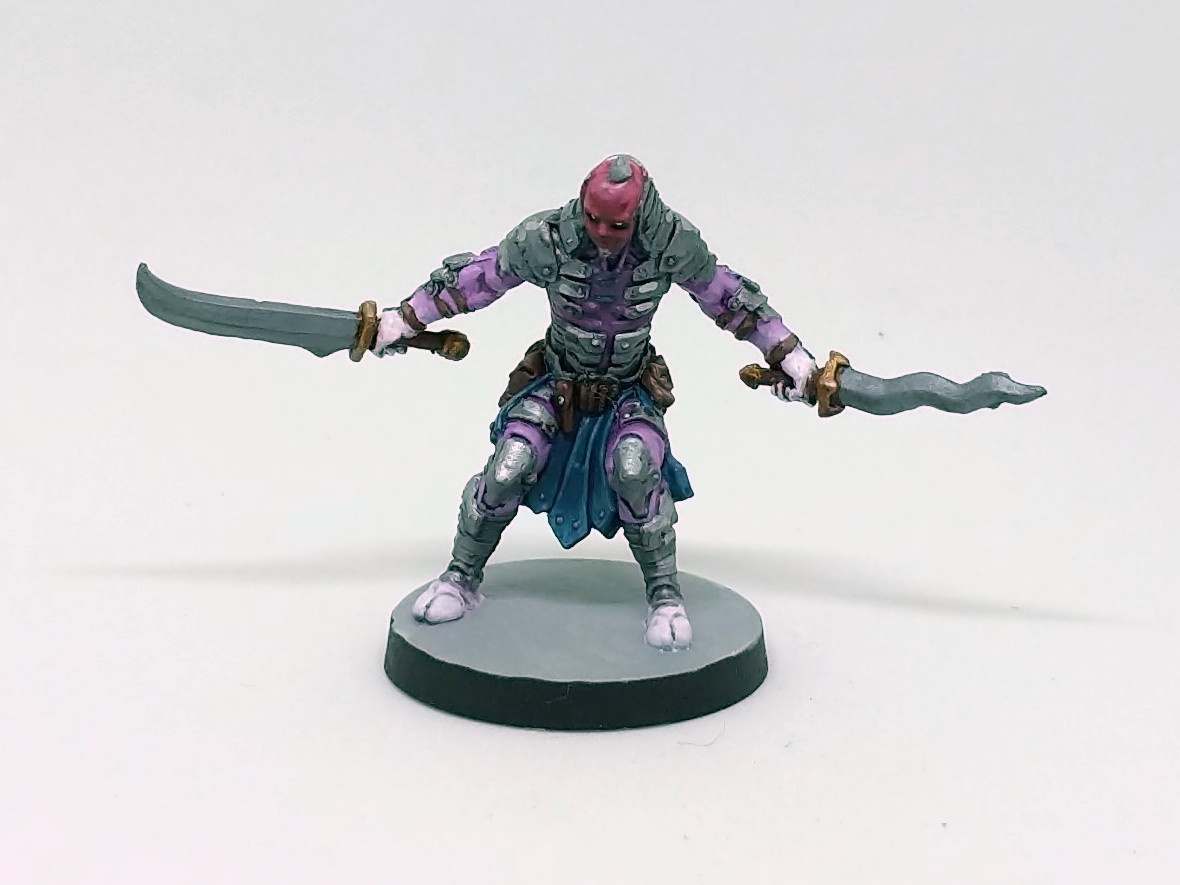
Myriam
Myriam
Myriam is one of my favorite characters in the set, in part because she breaks female magic-user stereotypes. She has a thickness to her that expresses strength and power. Her pose expresses this idea too: she will not be moved.
I do not paint a lot of dark-skinned characters, and I always approach the task with a bit of trepidation. Mixing the right color is part of the challenge, but the bigger part is getting the highlights right, since dark skin has as bright highlights as light skin. I ended up using a mix of Flat Earth, Dark Blue, Flat Green, and Flat Flesh to get her base skin tone, and I quite like the result. I probably could have brought some of the highlights up even farther, but I think it's pretty good as it is. The bald head combined with red facepaint was a challenge, since first I painted the whole head, and then added and highlighted the facepaint in a separate step. I happen to have a work-in-progress shot that shows just the flesh alone having been painted:
For her skirt, I mixed a dark orange wash to add some color variation into the recesses, mixing my red, yellow, and black inks. The result was not very good at first, though: it ended up with a rusty effect, which is not what you want on cloth. I ended up reworking a lot of the skirt. There are hints of the rusty shade in a few recesses, not enough to stand out and distract. It was definitely an adventurous mistake, but you can't make an omelette without painting a few purple skirts with the wrong shade color. Incidentally, the base color of the skirts were done with some wet-blending again, and although the transitions are nothing special, I think the color choices work well in the shaded underside of the back of her skirt.
Sicarius
Sicarius
This is Sicarius, whose recommended class is a Bloodmoon Assassin. I don't have the expansion that includes the Bloodmoon Assassin character class, but fortunately the publishers have made PDF versions of all the class sheets available, as described on this BGG thread. The one time Sicarius hit the table, we were underwhelmed by his character, which is a shame since he looks pretty darned cool. I showed my brother a work-in-progress photo, and he asked, "What is that guy?" Nobody knows.
The biggest challenge here was, of course, the blend from purple to white on the layer beneath his armor. This was another chance to practice some wet-blending, but also to practice visual trickery: the "blended" area is frequently hidden under armor, and so I had to give the illusion that there was a continuous blend even when it was covered. I think it turned out quite nice. The rest of him was pretty standard. I've been mixing my Vallejo Air metallic paints with some nonmetallics (grey, in this case) and applying my P3 Armor Wash for shade, following up with brushed-on highlights. It works fine here.
Sorcerers
Azrael
Azrael
"The angel of death?" I wondered. "The cat from Smurfs?" asked my wife. No, neither of these, but rather some kind of armored spearman with pointy ears. If I remember correctly, Azrael's flowing skirt was painted entirely with wet-blending except for some final steps of edge highlighting. I am quite happy with the level of contrast I was able to achieve. I did not explore colored shades for tonal variation; I think I just didn't think of it at the time since I was so pleased with how it looked already.
As with Sicarius, the armor is a blend of metallic and non-metallic. In the highlighting, it got further away from the metallic sheen and looks a little flat, but good enough for tabletop. The gold here is a blend of VMC Gold with ivory and a spot of P3 yellow ink—a slightly different formula than I have used before. As with the steel, I lost some sheen with my highlights using this approach.
Incidentally, Azrael was really wonky out of the box, his spear bent in an almost an "S". It seems he has some kind of scoliosis and needs to hold himself up. After dipping in hot water for a few seconds, I was able to adjust the spear to be nearly straight and then shock it into place with ice water. The weird thing here is that I'm not even sure what else changed. It's not like I plastic, so all that material that was curved up had to go somewhere. It's not clear to me if his arm was drooping or his slouch was exaggerated or what. There's still a bit of a bend in his spear, more visible from the side than from the front or back, but once again, tabletop quality is good enough for us. He's not cool like Lil' Ned after all.
Whisper
Whisper
This is Whisper, not to be confused with Silence from the base set, although I confuse their names all the time. CMON is doing a great job with these miniatures; the names, less so. Anyway, studying her card art, it was clear that she was mostly all one color, but the artist pulled a neat trick: by having her flowing cloak transition to a brighter color, her legs could still stand out against it even if they were the same base color as the cloak. I set in to painting the cloak, again practicing my wet-blending, and I think the results are great. I tried to keep the transition only at the fringes of the cloak, although looking at it now, maybe a little variation in the top two-thirds would have added even more visual interest. But remember, she doesn't want visual interest! That's why she's wearing a big dark cloak! That's why she has dark leggings! That's why she has a mask! That's why her cleavage is shouting out, "Stab me here." Oh... Hm.
Whisper was one where I thought, "Maybe I need one more highlight," so I went back to her while working on another character to add a little more pop. I took pictures before and after, but you cannot really see a difference. It's still not clear to me if it just didn't photograph well, if it was all in my head, or of it was a case of my seeing the paint wet (when it's brighter) and then dry (when it's duller).
Before?
After?
Looking at those photos, I suspect the real problem was that I was photographing under my bright painting light, which of course reflects off the highlighted areas. Changes to those areas just get washed out in the reflected light.
Changing subjects, who's the sorcerer all the others want to be like? It's another family favorite, Ajax.
Ajax
Ajax
He's a powerful foaming cleanser... I mean, he's a powerful sorcerer with the power to raise the dead and transmute loot toot suite. He also has a cool ghostly pallor with a subtle purple tone, paler yet than Lil' Ned. I went back to two-brush blending for his robes. His was another case where I wondered if I had enough contrast in the robes, but when I looked back at the card art, I saw that it was very dark.
Ajax is notable because he's the only figure in the set with any freehand painting. I tried to give the runes on his chest a subtle glowing effect by laying down a mid-orange first and then tracing a brighter yellow on top of it. It looked pretty good given the scale. I then tried to touch it up a little, and it wasn't clear if I had made it better or worse. Sadly, no photographic evidence can support either conclusion.
Noble Warriors
The Noble Warriors are a trio of fighting women who complement the male characters from elsewhere, including a Pit Fighter Berzerker similar to Siegfried, a Noble Warrior like Azrael, and a Shadow Barbarian like Bjorn.
Zoe
Zoe
Zoe is presumably Brak's love interest. (Interesting aside: I used to cover that song in my stage show at the ol' coffee house in graduate school.) Her card art presented an interesting challenge in that it was really hard to tell what color her skirt was. It decided to go with a blend from brownish-red to midnight blue. It's oddly dark compared to her magenta armor, but that seems to be what's happening, at least tonally, in the card art. There's also some careful wet blending on her shield, working around the metallic bits.
Her hair is another great example of how zenithal priming was helpful, since I could put a fairly thin coat on and get simple highlights for free. An ink wash and some manual highlights really makes it shine.
I believe Zoe is the first figure on which I've painted colored irises. Her eyes are very large, and so I had room to work in the color to good effect.
Sarah
Sarah
Sarah is clearly from the same legion as Azrael, and her billowing skirt was fun to paint, mixing together a variety of techniques. As with Zoe, her hair is sculpted so cleanly that it was easy to get it looking pretty good. I used a different metallic mix here than Azrael, using less non-metallic paint, and I think it came out more nicely. The specific mix here is Vallejo Model Air Steel with a little VMC Buff and Ivory. P3 Armor Wash added the shade, and a little white in the armor color was added for highlights.
I decided to try something different for Sarah's gold and go with straight ... well, it was either Game Color Old Gold or VMC Gold, seems I didn't write it down. In any case, I was reminded with a shock how very reflective those metallics are when you don't tone them down with nonmetallics. I suppose I had been using that trick for some time. The gold accents on her armor, sword, and shield really pick up light much more than anyone else in the set. I need to think some more about which approach I like better.
Did you notice how Sarah's armor looks like it would actually protect her from being injured? Did they learn the armorer's lesson? She and Azrael could fight side by side and know that the skill of their weapons would be how they are judged. Well done, CMON, for standing up for reasonable fantasy mini... oh hang on, there's one more character to go...
Mila
Mila
Ah, then there's Mila. I suppose there's some sense in which she's the counterpart to Bjorn, but whereas Bjorn is wearing furs and some kind of Girdle of Giant Strength, Mila looks like she wandered in from a Boris Vallejo painting. If you compare her to Myriam especially, there's really nothing powerful about her. It even looks like she can barely lift those two swords. She's eye candy of the worst kind, where they could have made a more convincing and powerful female barbarian. Also, yes, her bedroll is purple in the card art, so I went ahead with that despite its being somewhat dopey.
As for the painting, she was the only one that I had to strip. Yes, yes, I know, it's ironic. Trouble is, when I primed her, I noticed a seam line running down the left center side of her torso. There's no texture to hide it, but I thought that I could paint over it. After doing a fair job on the furs and a good job on the skin, the seam line was really glaring: I couldn't cover it up as I had hoped. Knowing I was doomed, I tried carving away the line, but of course this put gouges in the paint layers that were irreversible. Into the Green Stuff she went, and I re-primed her with figures from my next painting project and repainted her.
Her front is mostly flesh, and I think I did a good job of adding the highlights and blends. She reminded me of painting Lyssa from Runebound 3rd Edition, another toned bare-bellied woman where I had to imply a navel and muscle tone from a smooth surface. For Mila's cloak, my idea was to have variable colors in the hide, so I put in my base colors, added a wash for shade, and drybrushed the highlights. However, I think the result as photographed still has too much of the same tone: I was going for a light center and darker edges, but it comes out looking like broad highlights instead of color variation. It's not bad, but it's not quite what I had in mind. If I had to do it again, I would consider a different color entirely.
I've thought about just hiding Mila away somewhere since I don't like the implications it has for controlling gaze. At the same time, I wonder if I can use her to teach a lesson. We've used her a few times prior to painting, and one of the greatest abilities of her recommended class is that they can get a big boost for removing their armor. My boys and I laughed at gaining this skill, acting out ripping off armor like Hulk Hogan before charging into the fray. Seems that I'm torn between the two interpretations of the figure.
Closing Thoughts
These figures were a lot of fun to paint, although as I mentioned in my previous post, I think that's enough tattered cloaks for a while. The characters all seem to shop at Belt Pouch Outlet as well: the same visual elements show up in almost all the figures. Those are minor quibbles though for a group of characters with so much variation and style. I'm looking forward to getting Massive Darkness back on the table this weekend.
By the way, remember how happy I was in my last post about how all the pictures looked just right? Not too long after that, my Nexus 5X died in bootloop hell. Now I have a new device, and I took all of these pictures several times. The ones I've included here are the best of the bunch, but they're still not perfect. Using the default photo app, I had all kinds of trouble with consistency of pictures: the temperature of Lil' Ned and Azrael were vastly different. Doing post-processing in Snapseed didn't help the consistency problem. I ended up reinstalling OpenCamera so that I could get more manual controls. The pictures here were taken with automatic white balance turned on, ISO 100, and (I think) 1/100s shutter speed. This gave good consistent shots in my lightbox, and then I was able to adjust the white balance by picking up the background color in Snapseed. Some pictures are still slightly off, but they'll do for sharing here. I am rather disappointed that I have to go back to fiddling with these things just after my other set-up seemed to finally stabilize.
Also, I'm pretty sure I've never blogged this many words in one day before. After writing all afternoon and having dinner with the family, my wife went out, so I figured: why not do some hobby writing too?
Thanks for reading! Tune in next time when we make a genre shift to something with slightly fewer tattered robes.
Several times during the semester, I have wanted to share thoughts about my game programming course here, but time and other obligations have gotten the best of me. Now that the semester is wrapping up, I am making the time to focus on the last few weeks of the course and the roller-coaster of emotion it has been for me.
Background
To set up the story, it had been two or three years since I was able to teach my game programming course (CS315), and I revised the course design over the summer to center on Unreal Engine 4 and my Collaboration Station project. The students started the semester with a two-week project designed to get them into the UE4 basics. The project was called Angry Whatevers, and students had to create a simple playable game that involved physics and parabolic motion. I started a new playlist on YouTube to support the class during this period, starting with this pair of videos that give an appropriate framework using UE4's 3D primitives and Paper2D sprite system, respectively:
Because I was recording these videos on Windows, I had to learn a new video production pipeline as well. My first attempt used OBS Studio for the screen capture and OpenShot for video editing, in part since OpenShot is what I've been using on Linux for some time. I realized after posting the first edit of the first video that there were significant editing glitches. When I brought this up in class, the students expressed disdain at OpenShot and strongly encouraged that I learn Blender. I didn't even know that Blender had video editing support! It took some time to learn Blender's video editing system, but I ended up becoming fairly productive at doing simple editing with it.
In any case, all the students who did not withdraw from the class did fine in their Angry Whatevers project. Several students withdrew during this period, but none talked to me about their experience, so I have nothing but conjecture about causality here. We had a class meeting after Angry Whatevers during which I gave them the option to either move forward with another tutorial-style assignment or to move into forming teams for a bigger final project. They chose the latter. I prepared and delivered a presentation about Collaboration Station, showing the three minigames that I had not yet implemented, and I encouraged students to choose one of these as their semester project; however, I also gave them the freedom to propose something different, with the cautionary explanation that game design is hard. As you can probably predict, dear reader, all of the teams decided to pursue their own projects.
I had the teams write their pitches in Tim Ryan's game concept format, which I had to approve before they could move forward, and they organized their work as user stories expressed in Trello. More specifically, they used the "front" of each Trello card for the name of a user story in Mike Cohn's format, and they used the "back" to track the conditions of satisfaction, hour estimate, and team member assignment. My intention was to monitor teams' progress via their changes on Trello, but I quickly had to drop this plan as out of scope: I was overwhelmed this semester with the number of different projects I was supervising, and I could not afford this level of oversight. I was surprised when, after the first iteration, the students elected to continue using Trello the way I required for the first iteration. They found value in it, and so they required themselves to show their progress via Trello at each end-of-iteration presentation.
I'll note here that toward the end of the second iteration, the students expressed interest in learning more about the C++ side of UE4. Some students had thought about shifting some of their existing work from Blueprints to C++, but they were unsure how to dig in. I recorded a series of five videos that walked through an example designed for students with no C++ experience, although these were not ready until we were into the third iteration. No students ended up using C++, and avoiding such a thing in their third iteration is wise. However, looking at the video series, the first video has 49 views, the second has only 28, the third has 13, the fourth has 37, and the fifth has 29. If you can make any sense out of that, let me know. For the time being, I interpret that as meaning that students by and large didn't watch the series for their own edification. It took roughly 10 hours to make that video series, so hopefully I can recoup the investment either in a future class or in the long tail of YouTube.
The tumultuous end of the third iteration
I know that was a heck of a wind-up, but now we can get into the story of the last few weeks. At the end of the first iteration, I was pretty lenient in what I considered "satisfactory" since the teams were still really getting their feet wet with UE4. The second iteration, some teams did not have working core gameplay, and so I told them the work was unsatisfactory. What surprised me was that at the end of the third iteration, a majority of the projects had fundamental problems such as broken core gameplay, no audio or visual feedback, or no attention paid to user experience. This made me go look at their version control logs, and these pointed to the idea that many had simply not put in adequate effort. Before grading these final iterations, I went back to check the course description to see how specifically I had defined "satisfactory." To my great embarrassment, I didn't. I honestly remembered having written it up, but either I wrote it somewhere else and misplaced it, or I simply thought about it and never typed it up. In the absence of a rubric, the best I could do was fall back on the clear dictum: "Note that, because this is a three credit-hour course, you should expect to invest nine hours of attention to it per week." Clearly, some teams did not do this, with gaps of 15-19 days between commits.
There's another important piece to understanding my emotional reaction to the third iteration. The teams' presentations were split over two 75-minute class periods, with the day of a team's presentation being essentially random. It turns out that the Tuesday group was the disheartening one: no team presented something that I would call, in any way, "done." This led to an interesting conversation on Slack with a few students who were willing to speak up, though. I expressed my distress that they had not produced shippable games, but some students said that they never wanted to finish a project in the first place—they really just wanted to tinker around. That's interesting for several reasons, one being that they clearly didn't understand what I had tried to teach them about Scrum, but the other is that they claim to have had a fundamentally different perspective of the course goals all along. One student put it very clearly that he thought he was "learning game programming in order to learn Unreal Engine," which is vastly different from my intention, which was for them to learn Unreal Engine in order to do game programming. Students in the former category would probably have been disappointed at my lack of didactic lectures about specific UE4 features, whereas students in the latter category would appreciate the seminar-style of individual exploration and sharing of lessons learned.
After these conversations came the Thursday group, where two groups really nailed it, showing off games that were truly shippable. In their presentations, they shared specific and interesting tech tips in such a way that everyone in the room learned something. (We called this requirement the Feature Focus™). I thought about going back to Slack to try to understand how people in the other teams felt about the excellent Thursday presentations, but I did not. I did not want to come across as crass or petty, although I do really want to know what they thought, as I try to understand their perspective—or what they claim their perspective is, anyway.
This isn't even my finals form
When we wrapped up the second iteration, I gave the students the option of either working on their final project through to the end of the semester or to end a week early and do a different final assessment. The result of our discussion was that the students wanted to be able to choose either a traditional written final exam or a "jam" final. I had used the jam format back in 2011, and they seemed to like the idea when I told them about it.
I tried to make the two equitable, each designed to take four to six hours. I designed the jam format first, using my university's recently-announced new branding campaign, "We Fly," which appears to be beloved of upper administration and generally denounced by students. I put the following constraints and requirements on their submission to this final format:
Playable game implemented in Unreal Engine 4.17 or 4.18
Implemented by an individual student in CS315
The creators of any third-party assets are credited and licenses identified as per licensing requirements
Player input is managed through project settings
Core gameplay includes interaction of multiple actors in a level
Dynamic game state is tracked in the user interface (e.g. score or health trackers)
Clear goal and ending conditions
Include music and/or sound effects
Captures an interpretation of the theme
A casual observer will notice that these include some of the specific features whose absence surprised me in the third iteration.
The students presented their submissions during our university-assigned final exam slot, and I was delighted at the quality of their work. Students whose technical contributions and understanding were unclear to me showed that they had minimum expected competence with UE4, and students who had really pushed themselves showed some impressive jam-quality work. It was fun to see how many students poked gentle fun at the university's marketing efforts, with several games involving the destruction of money, amassing money, or throwing money into bottomless pits in order to create new slogans.
Seven students opted for the written final format, which consisted of three questions. The first had students research and report on binary space partitioning and its role in BSP brushes; we did not address this in class, and so I figured this would be a good assessment of their ability to explore new topics related to game programming. The second question involved deconstructing a classic arcade game and discussing how it would be implemented in UE4, along with a project management plan such as a Scrum product backlog. The third was a post-mortem of their team project in classic GDMag format.
Their responses to the first question were a mixed bag, the biggest problem being that some did not distinguish between BSP and UE4's BSP brushes. In a sense, the assessment "worked" because I was able to see their confusion.
The problems with the second question were more interesting. Some students showed significant trouble analyzing the game to determine its formal components and then arranging those into a series of steps. In retrospect, I had not given them much feedback on the project management portion of the class, and I know from experience with immersive learning teams that this is hard enough just by itself. Similarly, these students generally had no experience with game design, and so they lacked some vocabulary and mental models for how to separate a player experience from formal components. This part of the question may have been "unfair" in that it wasn't something I had really emphasized throughout the semester. There was also variance in the second part of the question, where some students waved their hands and talked about implementation in broad strokes, where others were more specific about what was actors, what was pawns, who should have what responsibilities, etc. I think if I were to give this type of exercise again, I would have to include more a specific description of what a correct answer would contain, since it was hard to distinguish whether students thought their submissions were adequate or whether they were writing and hoping for points (a phenomenon any instructor is familiar with). In the end, however, everyone that did anything reasonable on the written format got a satisfactory mark, so it's not worth fretting the details at this point.
Students' Review of the Course
At the end of our finals week meeting, I ran a quick semester retrospective with the students. I wrote four columns on the board: + (for positives), - (for negatives), Δ (for things to change), and ? (for lingering questions). I encouraged students to speak up and share their thoughts, and I logged them onto the board without commentary except occasionally to ask for clarification. I then asked if there was anything on the board that anyone strongly disagreed with, and the only point of contention was that some people seemed to dislike Blueprints, while others thought they were valuable. Finally, I went through each item and asked for a show of hands to get a sense of whether it was a majority issue or a minority issue. I've transcribed the list below, marking majority issues with a capital M and minority issues with a lower-case m; the one item without a marking was instead discussed as being a mix of positive and negative.
Positive:
Two-week intro (M)
Choice of project (M)
Open-endedness (M)
Working off of the same basis for the two-week project (M)
Video tutorials for the two-week project (M)
Showcases at the end of iteration and the final (M)
Feature Focus™ (M)
Slack (M)
Negative:
Ambiguous grading scale (M)
GitHub
Infrequent use of Slack (m)
Change:
More smaller projects (M)
Require participation in game jams (M)
More emphasis on scoping and estimating projects (m)
Host more class-based jams like the final (as opposed to external jams) (M)
Use "jam" format for intro weeks (m)
More C++ (m)
Smaller projects with specific technology learning outcomes (M)
More videos on specific Blueprint features (e.g. variables, conditionals) (M)
Encouraging more student-presentations on UE4 technology (M)
Theme the entire class, in part to help control scope (m)
Encourage use of Slack (M)
Less distribution of course content between Canvas and the course site (m)
Questions:
I may have learned more from the final jam than from the big project (M)
More jams? (M)
Would having more jams early in the semester positively influence the formation of final project teams, their preparation, their estimation? (m)
Blueprints vs conventional text-based code (esp. for things like data structures) (m)
Production pipeline, e.g. working between technical artists and gameplay programmers (m)
Canvas is better than Blackboard but Canvas is less than ideal (M)
The student who brought up that first item in the questions, he spoke for a few minutes about how the scale of the final project contributed to his putting off working on it. By contrast, he said, the final jam had a very tight timeline and very clear requirements, and so he knew he had to dive right into it. He did not address whether or not he could have done the final jam without having worked on the major project.
At the end of this discussion, I shared with them something that had been heavily on my mind the past two weeks or so. Many of them had experienced problems or complained about the challenges of their final project with respect to scope, estimation, and creative direction. I looked across the room and I asked them to think back to when we were first planning the final projects, and specifically, how I had laid out for them three minigames from Collaboration Station that were already designed and were perfectly scoped for their work during the semester, and how I had warned them that going in a different direction was not advisable for reasons of design and scope. Ah, I wish I could have captured the flood of emotions that I could see on their faces! At first, a moment of shock and surprise, and then a look of understanding, and then nervous laughter as all the pieces came together. When I followed this with, "I don't want to be an 'I-told-you-so...'" they really let loose and had a good laugh. It's true, though, and I told them that I hoped that this was a good lesson for them in understanding how complex this area of study really is. I think we were all able to leave with high spirits despite having been a bit in the doldrums a week earlier.
Jam in the place where you work
Clearly, the idea of "jams" came up quite a bit in our semester retrospective, I'm sure in part because they had just had a generally positive experience working on the final exam jam. As I got to thinking about it, though, I still had some questions about what they were really talking about. A single-person effort isn't really a "jam": the term comes from musicians' jam sessions. The metaphor is also just a sort of fun wrapper around an academic assignment, and isn't it strange that students would say, effectively, "give us more assignments!" Maybe not so strange, given the one student's comment about learning more from the short experience rather than the longer one. In any case, I turned back to the class' Slack and posed the problem back to them. I articulated what I thought were the five characteristics of the jam format, and asked them to thumb-up the ones that they thought were most important or essential. Here's where the votes have stabilized:
Individual completion (1)
Themed (6)
Timeboxed at no more than one week (4)
General guidelines of satisfactory completion, as in the final exam jam format (9)
Presented in class (0)
I am a little perplexed at the zero votes on the bottom one, given some of the other results of the retrospective, but that one was also last in the list just before a block of text, so maybe people missed it.
What stands out to me is that the things they most wanted were the guidelines, which are really standard fare, and their omission from the final project was an oversight on my part. I've been thinking more about specifications grading and how that might be useful for a class like this. My colleague David Largent has been using specs grading in his classes and has started giving some regional presentations about his efforts. I could see criteria for a future iteration of the course looking something like this:
D: I can run the game without crashing.
C: The core gameplay is functional and gameplay state is tracked on-screen
B: The game includes audio and visual feedback for core gameplay
A: The game can be packaged and launched
That's just a sketch, but I think you get the idea. I can set up the hurdles that teams have to cross more explicitly to get the grade they want. Of course, this opens up a problem I had this semester and alluded to above: I had a student come to my office upset with his grade, and I told him the core gameplay didn't work. He asked, "What's the core gameplay?" I would have to be careful in the specifications and future course design to qualify any game design terminology, since clearly not everyone will be familiar with it, even if they are hobbyist gamers.
Wrapping up
The coarse-grained grading scheme that I adopted turned out working OK, although not without its own struggles. When students mentioned "ambiguous grading scheme," I assumed they meant that I had not rigorously defined "satisfactory," but judging from some of the questions I've received the last few days, it's possible they were confused by the variable MacGuffin system. This is another area where I wish I knew what the students actually were referencing, but I'm afraid that moment has passed. It's possible each student meant something different, but they generally didn't like ambiguity, so may as well vote for that one. However, looking at the grades on my spreadsheet, I think they lined up to fairly represent my intuitive understanding of what students learned during the semester.
There were also opportunities for achievements that I didn't think of until it was too late. Regular readers know that I enjoy painting miniatures, and the last few weeks I decided to listen to a few GDC lectures on YouTube while painting. I realized, in retrospect, that I should have had an achievement for students to do the same. The 2016 Tech Toolbox, for example, would have been a great item for students to study and respond to. The way that I had articulated the Connected achievement gave preference to in-person meetings, but there is such a valuable repository of knowledge distributed on the Internet, I could have used the course as a chance to get students connected to that as well.
That about wraps it up for CS315 in Fall 2017. Word on the street is that we may be able to go back to offering this every Fall, now that we have had some successful faculty searches. I would like to get it back on a regular rotation and hone the structure of it the way that I have CS222. This semester felt a bit choppy, but I had some very talented students who were willing to talk with me honestly about it, and I'm grateful for that.
I am having some trouble articulating a particular question (or family of questions) for Serious Game Design final exam. When having trouble thinking about something, it helps to write about it, so here goes.
Regular readers may recall that I am teaching a Serious Game Design course as an Honors Colloquium this semester. My students are prototyping educational games as part of a larger immersive learning project with Minnetrista, a local cultural center and museum. Over the summer, I wrote about a structural change in the course: my hope was that by investing more time into readings and activities early in the semester, my students would create better prototypes by the end of the semester. We spent from August 24 through October 5 engaged in a series of readings and exercises, which you can read about on the course schedule if you wish. October 12 through 24 was spent on a series of concept documents and project pitches as students figured out what kind of game they wanted to create, and then October 26 through November 30 was spent on production. Next week, they present their projects to our community partner, and after that, it's finals week.
During the production period, students gave a series of in-class status reports, during which they had to comment upon what design challenge they were working on, what kind of evaluation they conducted, what evidence they gathered, and what conclusions they drew from this. These requirements were not treated rigorously, neither by my assessments nor by the students; I see this now in retrospect, that I would wager students couldn't even tell you what the status reports were supposed to be about. I will need to consider more rigorous assessment of this in the future perhaps.
Be that as it may, I noticed about two weeks into these status reports that up to that point, students had made no reference to any activity from the first half of the course. What triggered this observation was when a student explicitly tied their game to a visitor classification taxonomy that our partner shared with them. In particular, she acknowledged that her game was for the "rechargers" who came to Minnetrista's grounds to mentally, emotionally, or spiritually recharge. Her observation caused me to reflect on how no one else had done this, and then by extension, that no one had framed their work within any of the formal or theoretic models we had studied. Going back even to their various concept documents, there is no mention of the work from the first half of the semester. Crucially to this discussion, it was not required to do so. I mentioned the lack of explicit theoretic grounding to them this past week, when we had a minute or two before class was dismissed, as something that had been on my mind. They nodded in acknowledgement but their minds were clearly on their way to their next obligation.
The fundamental question I have is Why? It's a question I have for myself, but it's a question I want them to wrestle with. I took my first pass at articulating this as the last part of their final exam, which I was working on this morning:
Consider the discussions we have been having in class during the pitch and production period (October 17 through November 30) along with the essays you have written above. My notes suggest that during the second half of the semester, there were essentially zero student-generated references to the theories we studied in the first half of the class. Write an essay addressing the question, Why is that? To address this, you might consider corresponding questions such as Could it have been otherwise? or What are the relative merits of personal opinion vs. theory?, although there are certainly other directions one could take a thoughtful discussion.
The prompt above is the result of considerable revision, but I am still not entirely happy with it. As I explained it to my wife over lunch, there's another side to it that perhaps is even more difficult. Given that the students did not justify their designs using the theories we studied, and that they did not reference these theories in the feedback they gave each other, I have to ask the question: if they had not spent the first half of the semester grounding themselves in theory, would they have still made the same product at the end? There's another, potentially less charitable way to put it: did they actually learn anything during that first half of the semester?
There's a sense in which these are research questions: I could, in theory, teach a pair of courses that are structurally identical except for the entire first half, and see if the resulting games—and discussion around those games—shows any qualitative difference. That would be interesting, but I lack the resources to pull off such a thing. A related study would be to take two courses that are structural identical except that in one of them, I require students to contextualize their work in theory, for example in each status report.
Those questions are more about me and my scholarly interests: I see the inherent problem for the final exam as being something that students should grapple with. What does it mean for them that they did not reference any of the theories we discussed? Do they believe they learned? Maybe more pointedly, did they not ground their work in theory on purpose or on accident? That is, were they lazy by choice or did they not even consider the idea that those earlier concepts should be referenced? And if the latter then, by extension, we're back to: Why?
Collecting my thoughts here hasn't exactly cleared up the issue in my mind, but at least I have my thoughts all in one place for future reference. Once we get through the final presentations next week, I will have some time to more carefully consider the matter and come back to the questions on the final exam.
A footnote of sorts: One may think, "Aren't you concerned that you are writing your final exam questions online in public prior to them being assigned?" The truth is, if any of my students are following my writings on games in learning, I think they are far enough ahead of the game that it wouldn't matter, since they'd have seen this question coming a mile away!
If you have any suggestions on how to frame the question, feel free to share them in the comments. Thanks for reading!
I've written occasionally about how I use an adaptation of George Kembel's design thinking framework in my teaching and research. Back in April 2016, I gave an overview of how I use it in CS222; today, I will give a few more details, since I saw something new happen this semester that I haven't seen before.
A Design Thinking Framework
I introduce this design thinking framework during the third iteration of the CS222 final project. I tell my students about how I use it and how my teams have used it, usually by leaning on the story of my VBC seminar—a story that is repeated in my Meaningful Play 2012 paper. The short version of that story is that, even though that team knew this reference model ahead of time, they fell into an Ideate-Build-Test loop that brought them further and further away from the community partner's needs and an understanding of the audience. It wasn't until an outside force pushed on them that they were able to recognize the problem and realign themselves.
The CS222 exercise has each team start by drawing the model on the whiteboard, and I challenge them to trace their paths through the different phases, starting with what initiated their project pitch. I encourage them to annotate each arc with evidence, noting how they know that they shifted between phases. I have to be careful to tell them that no path is wrong, especially since they didn't have this model ahead of time; rather, we are using this reference model to describe different kinds of activities and consider the transition between them.
After fifteen or twenty minutes of working at the whiteboard, a student team might come up with something like this:
The above diagram is from a team who decided to create an Android project, and they did not know what kind of challenges they would face by having to learn a new platform. It's not uncommon for these teams to have no activity in the Empathy area: it wasn't required, and teams usually jump in with Ideate. After all, my CS222 class is the first place in the curriculum where I empower them to make what they want, since I'm evaluating the processes they follow rather than looking for a specific implementation detail.
Some of the teams take a bit more care in laying out and labeling the diagram, producing something like this:
This happens to come from a team that is building a tool to assist students in scheduling classes. Again, it's not so much the content of these figures that's important, but the form. Once everyone has completed their diagrams, we go around the room and ask for an overview of the process. This usually leads to some interesting discussions, for example about the role of empathy, or the difference between identifying problems and coming up with solutions.
On Tuesday, I noticed something on the board that I didn't remember seeing before. Check out this diagram from a team that is creating a Dungeons & Dragons character generator:
In particular, look at the arc coming out of Ideate and how it heads toward Build and then spins back around to Identify. I asked the team about this to make sure I was reading it right, and they confirmed: after coming up with ideas, they were prepared build a model... but then they realized that they weren't really sure what problem they were solving. In pure graph-theoretic terms, it's just a directed edge from Ideate to Identify, but it's clearly so much more than that: the team felt a force on them, they felt a shift, and they pushed themselves purposefully in a particular direction. I am not sure what to label this phenomenon. I thought about "storytelling arcs" but that sounds like three-act structure, and I thought about "narrative arcs" but that's even worse. I'll call it a "redirected edge" for now.
I talked to this team as they were working on the diagram, and a few minutes later, we had the class presentations. The first team to present is working on a tool that aggregates online information for people who are moving to a new city, and their diagram looked like this:
Look at the black arc from Identify to Build: it's another redirected edge! In this case, the team identified the problems that they would like to solve and had planned on using the Zillow API. When they sat down to start building experimental code, it was only then that they realized the API would not work, and so they bounced over to Ideate to come up with new potential solutions to their problems. Now, one might argue that they had in fact been in the Build state, or that they were not really coming from the Identify phase because they had ideas of how to solve the problems, but that's not relevant here.
I'm not so interested with how well the students understood the design thinking framework after a thirty-minute introduction, but rather with how they are using the diagrams to build a visual narrative of key events in their project. The rest of the arcs in all the diagrams I have shared are drawn in a pragmatic way, with some care toward making the lines clear and reducing edge crossings. These redirected edges are different: they are capturing a feeling the teams had. In the case of the D&D team, they had a feeling of moving in one way and then being pulled in a different one. In the case of the Moving Cities team, they felt like they "bounced" off of one phase and landed in another.
I am not entirely sure what all this means, but it strikes me as interesting. I don't remember having seen it before, and the fact that I saw it twice on Tuesday struck me. If nothing else, I want to keep my eyes open to this kind of phenomenon, where the team is breaking out of the genre norm to express something meaningful to the team. Maybe there's even something there that could be used as a seed of a team retrospective meeting. The diagrams reminds me in some ways of when I used to use mind maps in CS222, that most of them would be somewhat perfunctory but occasionally I would see one that told pieces of a coherent story. I have since cut that exercise primarily for time's sake, although I think about bringing it back in.
Thanks for reading, and if you're reading this on the day it was published or its anniversary, Happy Thanksgiving!


