Following up on the monsters, I have finally finished up the heroes from the Visions of Dawn expansion to Descent: Journeys In the Dark 2nd edition. I started playing the Road to Legend co-operative app with my wife and son, and we enjoyed the tutorial campaign with a party comprising Leoric of the Book, Syndrael, and Avric Albright. I painted those first so we could start playing while I worked on the rest. We decided to switch up the party as we went into the main campaign, and so now we're using Widow Tarha from the base set along with Ispher and Sir Valadir from Visions of Dawn. I think we're a handful of scenarios in and enjoying the experience. Just this morning, I put the finishing touches on Nara the Fang to wrap up Visions of Dawn, but I still have two heroes left to paint from the base set. I think it's interesting to note that the three last figures have been the Scout archetypes. It seems to me that if you're playing a three-player fantasy game, it's pretty natural to consider that you need a healer and a tank, and then a glass-cannon spellcaster seems a natural third. Then again, this logic completely failed when we played Temple of Elemental Evil, where the rogue was perhaps the MVP because of his ability to remove those deadly traps.
But I digress. On to the Visions of Dawn heroes!
Well, not just yet. Let me mention that I'm still trying to figure out the best way to produce consistent, reliable, accurate photos of my miniatures. I took these pictures in my light box, but the whites were still muted and dull. I used the new levels editor in Google Photos to pop the white level up to the max in post-processing. I think these look just about right.
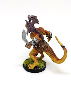
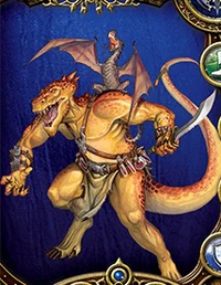
As I mentioned in Part 1, this expansion was a gift from my brother, and his primary motivation was that my family have this guy in our arsenal: Ispher. He has proven to be quite the resilient healer in our campaign so far, and I also think it's a mighty fine paint job. When I first looked at the card art, I got the impression that he was being front-lit by a fire:
It's hard to un-see that, but I suppose it's an artifact of having an orange-yellow front and a dark orange back.
The first step was wet-blending the overall skin tones. Just as Sorastro has started doing more wet-blending, I have also tried to think of ways to hone this skill. Here's a work-in-progress shot from this first step:
That's a pretty nice job, I say, and the later steps of ink wash and adding the scaly details help sell it.
I wanted to add additional spots besides the ones that are sculpted in, and the last time I've done something like this may have been back with my Imperial Assault nexus, where I added stripes to match the card art. I used a thinned sepia ink to add the spots. It turned out fine, but if I did it again, I would use more layers of thinner ink, with more variation in spot intensity.
You can barely see the vials on his belt, but I had never painted anything quite like that before. I was inspired by the techniques shared by Eye of Terror and C'tan. I used white as a basic glass color, which is also what is used in the card art. I thought about trying to tint it with the colors around it, which of course transparent glass would do, but this was the last detail, and I was getting a feeling of diminishing returns.
Overall, I'm quite happy with Ispher. He has a nice sculpt, and the paint scheme on the card art combines yellows and browns in a nice way, offset by his grey-purple dragonet. My only complaint is that he takes up an awful lot of room on the table, so it can be quite tricky to fit him onto the board when there's a melee fracas.
Next up, Sir Valadir:
A good sculptor will tell some kind of story with their work, and I want to take a moment here to share my thoughts about Sir Valadir's story—not having read any of the fiction or fluff around him. This guy is a cocky bastard, but he's talented. His smile tells you that he's ready for battle, and he knows he's going to win. He wears gaudy armor that's more for show than anything: he leaves his arms almost completely unprotected. Neither sheath nor scabbard for Sir Valadir: he carries his sword at the ready, resting it on his unprotected shoulder.
OK, now to the painting. Valadir was a challenge because of all the fiddly details on his armor, but the sculpt was nice and matched the card art almost perfectly. This made it fairly easy to block in the colors and then clean up the shadows and highlights. The four fiery tongues on the top side of the shield were outlined in the sculpt, but the bottom one I freehanded to match the card art. Freehanding is tricky in the best of times, but this was done over sculpted wood texture. I'm glad I added some extra layers and highlights, since my original pass was too dim. Looking at it now, it could probably have had even more highlights added, to help it read from across the table.
Last up is Nara the Fang. Once again, I found this to be a high quality sculpt for a board game miniature. The details were nice, and she's full of character. I'm happy with how the skin came out, even though it's a bit less yellow than the card art. I tried to be very intentional about increasing the highlights and contrast—something that regular readers of my painting reflections will know that I continue to focus on improving. Red is a tricky color to highlight, and maybe I could have taken it a little higher too, but I think it's sufficient here, and the lack of stark highlights implies an appropriate cloth-like texture.
You might be saying to yourself, "Hey, what about Master Thorn, the fourth hero from the expansion?" I already have a nicely-painted Master Thorn from Runebound 3rd Edition, so I didn't see a need for another. It gives me a convenient spare mini for some time when one of my boys wants something to paint.
Thanks for reading!


No comments:
Post a Comment