Like many fans of
Imperial Assault, I was glad to hear that Fantasy Flight Games was planning to release an app to allow purely cooperative play. After all, I had already painted and enjoyed the core set (
part 1,
part 2) and
the Twin Shadows expansion. Having heard that the release was imminent, I bought myself an early Christmas present:
the Jabba's Realm expansion. Now normally I go through my miniatures in the order I painted them, but for the sake of telling a good story, let me start with the big cheese.
 |
| Nice. |
Return of the Jedi was one of the first movies I remember seeing in a theater. Not
the first, which was
The Fox and the Hound, but certainly among the first. I remember going to my grandparents' house afterward and telling my grandfather all about it. Let me state clearly, I am not certain that any of these memories really happened: they emerge from a kind of mental haze where sometimes they seem more true than others. Be that as it may, I definitely did see
Return of the Jedi, I definitely did play Ewoks with my grandparents' neighbors, and my brother and I definitely had a whole bunch of
Star Wars merchandise.
Let me tell you a story about my family. My dad has always loved monsters and creatures of all kinds. My brother and I used to sit next to him while he read old monster comics from the Kirby & Ditko era, stuff like
Strange Tales and
Tales to Astonish. The first word I learned to read was "Doom," which featured prominently in many of these stories. The fact that the stories' protagonists were geeky scientists who saved the world from danger may have had an impact on us, given that we are both now professors and scientists.
When we saw
Return of the Jedi, of course my dad loved the Rancor. Who wouldn't? He either bought or was gifted the classic Mattel Rancor figure. Dad did not give us the Rancor to play with—much to the confusion of my young mind, which thought of toys as being for kids, so of course he should let us play with it. Instead, he painted it and set it on display on the big desk in the front room. You can find images of the generic Rancor toy online, but to me they look so plain, not like the one that watched us from his perch on the desk.
Fast forward some thirty-some years, and
Sorastro produces
a wonderful video in which he paints the Rancor miniature from the
Jabba's Realm expansion to
Imperial Assault. This put the expansion on my radar, and
the release date of the Imperial Assault co-op app was enough to push me over the edge.
That's my story, now let's get into the miniatures. I'll come back to the Rancor in chronological order, since I started with these other classics from Episode VI.
 |
| Gamorrean Guards |
I decided to keep the Gamorrean Guards in fairly traditional
RotJ colors, but I needed to distinguish the elites from the normal units. The elites are on the right, with a red sash and copper-colored spears. These guys were fun to paint. I didn't do anything too crazy with them, but I am really happy with the amount of contrast.
All the figures in this set except for the Jet Troopers were zenithally primed from my airbrush in three layers: black, grey, and white. I am really enjoying this technique, mostly because it's so much easier to see the model details, and also because it clarifies where shade can be. For the Gamorrean Guards, it made painting their ... pants? ... quite straightforward: thinned paint to get the base tone, with the highlights showing through, then just a little wash and highlight for increased contrast.
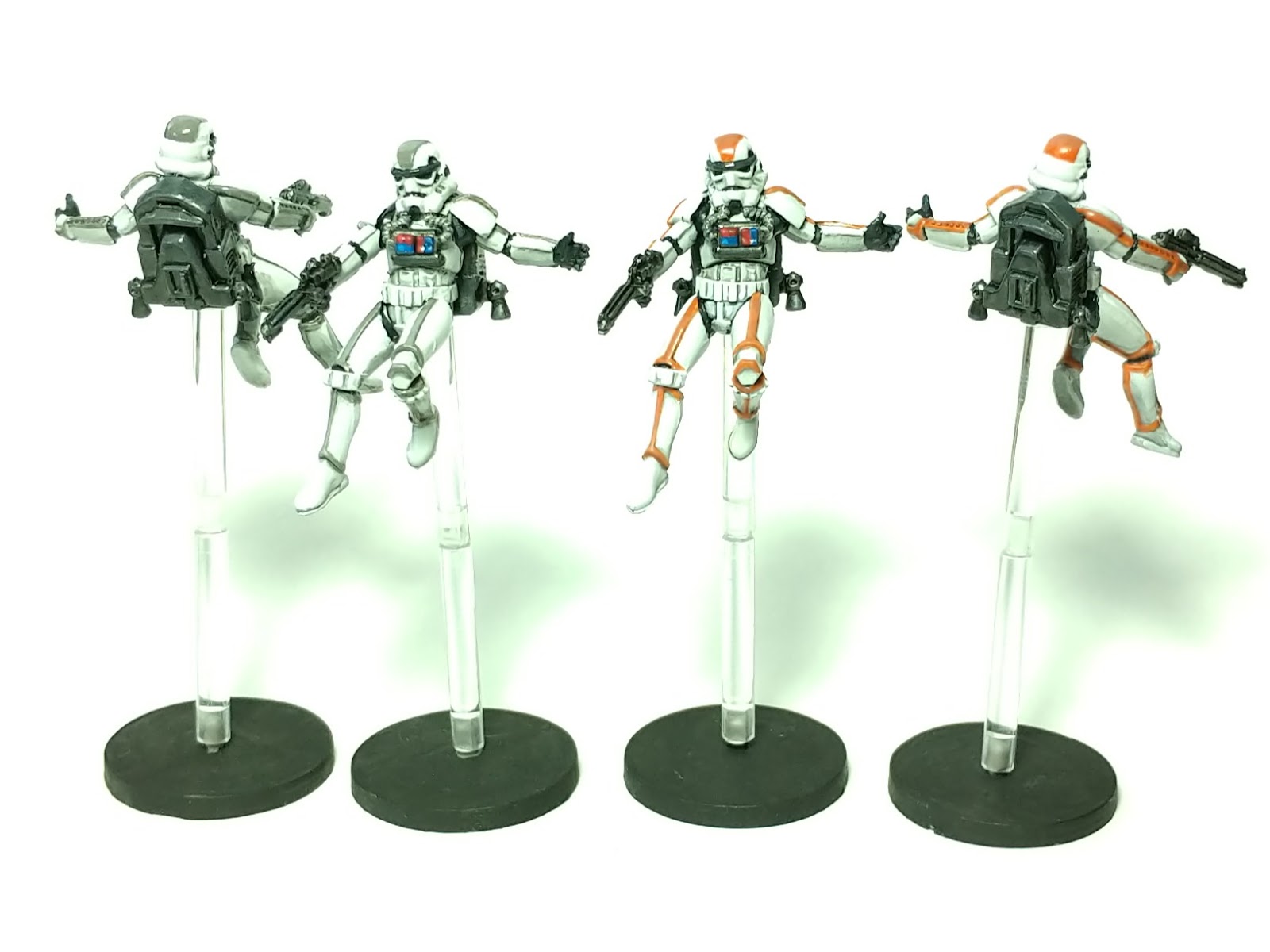
 |
| Jet Troopers |
The stripes on the jet troopers give them a little more pizzazz than the regular or heavy Storm Troopers. The downside is that they are kind of goofy. The card art leaves room for interpretation, and I had fun looking around the Web to see how others approached painting them. I saw some very nice custom sculpted flame effects on the jets, and I considered doing something similar. By the time I got the bulk of them done, though, I felt like moving on, so even the jet backpacks are really just perfunctory. Good enough for tabletop. It's hard to imagine that we'd really miss the detail, when Storm Troopers are rarely on the table for long.
 |
| Weequay Pirates |
I was least excited about these guys, but I think they turned out well. That's a good thing, since they took ages: so many shades of brown, with lots of overlapping bits. While I was working on the skin for these guys, I had one of those moments where they looked good under my painting lamp, but I thought, "Is that really enough contrast?" I took it one step further and got a little panicked, but when I held them out at arm's length, it was really needed for the extra pop.
As with the Gamorrean guards, and unlike my Trandoshans, I wanted to keep with the color schemes seen in the movie. The differences between the regular (left) and elite (right) are the colors of the knife and of some of the leatherwork, notably the pauldrons. Time will tell if that was sufficient or if I should go in and change something more dramatic, such as the weapon or hair.
 |
| Rancor |
 |
| Rancor |
As Sorastro promised in his video, the Rancor was not too difficult and lots of fun to paint. I more or less followed the steps from Sorastro's video, starting with a wet-blending of the base coats. I was having so much fun, I actually forgot a step: I didn't drybrush highlights on before washing as I intended; a combination of light drybrushing and manual highlights later seemed to cover for the mistake.
What might not be so evident from the photos above is the difference between the lit and unlit portions of the model. Take a look at this:
 |
| I've fallen, and I can't stop making 1980s references |
That picture makes it easier to see the darker underbelly. Actually, the picture is
too bright I think; the difference is more stark. It's kind of a neat trick that I remember reading about when I was first getting into painting and trying to understand highlights and shades: holding the model upright, it looks normal; flip it upside-down and it looks goofy because of the shades on top.
I did some subtle tinting of the model, though more subtly than Sorastro's. The back and top have a greenish hue, and the face and neck have an orange tint. Unlike most of my subtle moves which, in retrospect, look too subtle, I think this worked out OK, preserving the overall brown color of the figure.
Somewhere in the middle of working on these miniatures, I made a trip to Hobby Lobby to pick up a model kit for my son's birthday. While there, I figured I'd spend a few bucks and try Vallejo's Glaze Medium—something that good ol' Sorastro uses all the time.
 |
| Smooth. |
Wow, this stuff is amazing. A drop or two in some paint gives it a wonderful creamy texture and lots of open time for blending. If adding a little water as well, then the transparency starts to come through, for when underlying zenithal highlights should be shown. I've been using Liquitex Glaze Medium for several years for my glazes. It is thick and gloopy, where Vallejo's is quite thin. The Liquitex is definitely good for adding body and performance back to paint that has been aggressively thinned with water for traditional glazing. I haven't tried this with Vallejo's, but aside from idle curiosity, I cannot think of a particular reason to when I have the Liquitex. It's more of the texture and open time that I'm enjoying from the Vallejo product than anything I would call "glazing."
Enough fun with giant monsters and additives: time to move on to the heroes.
Here is Onar Koma, the furious bodyguard. It can be hard to tell if an aqualish is furious, but if you asked him, he would tell you he is furious, I'm sure. The hazard stripes on his shoulder were freehanded, dark grey over a yellow gradient. They came out perhaps a bit wider than the card art suggests, but I think they look fine for what they are. The weapon on his back is nothing special, but I spent a little time trying to get the two-tone colors of his handgun.
I continued to experiment with wet-blending base colors for many of the figures in this set, but I certainly spent more time on the uniques. For Onar Koma, I think I got a very nice transition from lit to shaded skin, using selective washing to emphasize his musculature. Again, the glaze medium was quite helpful here in giving a little extra time to get smooth blends in place; follow this with a wash to bring the tones together and then brushed highlights, and it turns out effective and fairly quick.
Onar Koma seems like an interesting character to play, since he has a lot of health but no defense dice. That's different enough to be intriguing.
Vinto Hreeda has the most dynamic pose of the set, and he was fun to paint. I think the eyes turned out quite nice: that's all painted effect, not gloss varnish. The little red accents on his shoulders were freehanded to match the card art and broke up otherwise dull metal ribbing.
Shyla Varad also has a bit of freehanding: that colored divot in the middle of her chestplate is all painted on top of a flat panel to match the card art. The real challenge with her was the skin tone. Her card art gives her a medium dark flesh tone of uncertain ethnic heritage, but I thought the sculpt made her look distinctly South American. Her eyes are squinting so as to be nearly closed, so I decided not to paint them in, although searching around the Web, you find plenty of other interpretations.
Her armor—and practically all of the metals in the set—were painted by mixing my Vallejo Air Metallics with regular acrylics in about 50/50 proportions. This means the weapons of this set are a bit more muted than my base game characters, but I think the effect is good.
 |
| Mandatory Heroes vs. Rancor Shot |
I gave all these miniatures flat black bases to match the rest of my
Imperial Assault miniatures. However, I read something in the past few weeks that stuck in my head: a talented painter explained that he doesn't like black bases because he wants the highest contrast of the model to be on the figure, not between the figure and the base. (I'll add a link if I can remember where I saw that or stumble across it again; drop it in the comments if you know.) I'm not sure it's worth my going back and repainting all the
Imperial Assault bases to something like medium gray, but it is something I am considering moving forward. Also, I think I prefer flocked bases generally speaking, but I also like
finishing projects, so these guys will just have to live with it.
Regular readers may recall my periodic frustration with my miniature photography process; astute and regular readers may have noticed that these pictures all have clear colors and consistent temperatures. It was my third batch of photos of this set, the first two having been taken in my lightbox using a combination of apps and settings. In a fit of frustration, I decided to just go back to my old standby: curl a piece of copier paper, set it on my desk under my painting lamp, and take a photo. This got me very close to what I wanted using the default camera app on my phone, and it was moderately better with manual exposure settings. I switched to
OpenCamera, where I could modify additional settings. For this shoot, I used ISO 100 with 1/100s exposure time. For the record, I shot them around noon when the sun was behind some clouds. I swear, one of these days I'll have a predictable configuration.
My sons and I already played through the
Imperial Assault app campaign, when it only supported the enemies from the base set. It was recently upgraded to include all the expansion enemies, but as far as I can tell, it's still the same campaign. Looks like I'll probably sit on these miniatures until the next major update to the app. While we had fun with the mini-campaign of the
Twin Shadows expansion, I'm not sure I want to run the longer campaign from
Jabba's Realm with them, not when we have so many other exciting games waiting to get to the table.
One last note for anyone who might want to leave a comment, and it's the same warning I gave my students this semester: no discussion of
Star Wars movies made after 1983. We don't want any spoilers, after all, or to acknowledge that some of them are ridiculously bad.
Thanks for reading!


No comments:
Post a Comment