
I picked up a copy as soon as I could and got the figures primed, but then I went several weeks without touching my brushes. There were a few reasons for this, including Divinity: Original Sin 2 and Pillars of Eternity 2: Deadfire, as well as more professional obligations. I find that there's a problem here where the longer you put the brushes down, somehow they become more intimidating to pick up. When I primed the figures, I was struck by how very round they are. Most of the miniatures are comprised of simple, smooth geometric shapes with very little detail. This means they do look like children's toys, but it also means a lot of trouble painting. Smooth, featureless surfaces are the worst—there's nowhere to hide.
Once I got my head clear and my confidence up, I jumped in with the mongrels. For those who don't know, "weathering" is the process of taking a nicely painted miniature and making it look dirty and worn. It's not something I've ever done. When I paint a miniature, especially if I am happy with it, then I am loath to risk messing it up. Almost all of my colors are custom mixed from a limited collection of paints, and so it's arduous or impossible to re-mix base colors should I need to cover up weathering gone awry. I interpreted the card art of the mongrels to depict old, rusty, mechanical dogs, and I decided this would be a good chance to try painting rust. Regular readers will remember that I've been using zenithal priming on my miniatures since acquiring an airbrush last Fall; the mongrels were the first that I've primed differently since then, using a basecoat of Vallejo Model Air GunMetal and zenithal highlights of VMA Steel. Knowing I could easily brush these back on gave me a bit of courage to move forward with the weathering.


I should also mention, as a note to future self, that all the enemies' bases were painted with a mix of Americana Slate Grey with just a dab of Americana Lamp Black—roughly a 6:1 ratio to get a more neutral grey.


Crawlies are, of course, rusty metallic hermit crabs that make their homes in abandoned dolls' heads. A fun family game! Anyway, I am happy with how they turned out. I had used a conventional monochrome zenithal prime on these, so I brushed on the VMA gunmetal to the mechanical parts and drybrushed silver highlights before following the same weathering process as the mongrels.
For the dolls' heads, I followed a fairly normal flesh approach except for mixing in a bit of purple to add a deathly pallor. Sure, I know they're not really dead dolls, but they still seemed to call out for such coloration. The hair was the easiest part thanks to the zenithal priming approach, as I've noted in previous painting posts: mix the color, thin with some glaze medium and a little water, and brush it on. The white undercoat gives highlights for free, which can then be touched up by hand in any spots that call for it.
Only one more set of minions to go, and that's the Dark Hearts.

These seem to be stitched-together amalgams of discarded stuffies. The card art suggests that some pieces are striped, but I opted for simple monochrome sections taken from a single palette of green, purple, and pale yellow. These were the first of the rounded, featureless miniatures, and so I used it as an excuse to brush up (ha!) on my wet blending. Each section was wet-blended, using a bit of the magic Vallejo Glaze Medium to add open time and workability. Looking over them, I could go back in and add some polka dots and stripes if I wanted to, but these are satisfactory. The shading and highlighting is decent, but I think the stitching and chest cavities are really the best parts: it's a clever sculpt, despite being uncomplicated, and the painted stitches and stuffing really sell the illusion.
Twelve minions is probably enough minions, and so from here I moved on to the heroes. I was inspired by Duke of the Blood Keep's Stuffed Fables painting series to paint the base of each hero according to the color of die associated with them. I'll show the heroes in the order I painted them, even though I found out later it's not the order they show up in the game.


Given her prominent position in the fiction and the box art, one senses that Theadora is the heroine of the stuffies. Also, remember the trope: fantasy character with sword = leader. She's the one who doesn't have a particular die color associated with her, so she got an off-white base.
All of these heroes were painted primarily using wet blending, occasionally with a bit of layering to accentuate highlights and shadows. I matched the colors on the card art as well as I could. I think she turned out nicely. Held up close on in the pictures, you can see a few spots where the blends are not as smooth as I would like, but it looks fine on the table (especially considering that my gaming table has rather diffuse lighting). I did not spend inordinate time on any of the heroes, each taking around two or three hours.


This is Stitch, who has a lot more detail than the rest of the stuffies. Stuffed Fables story is about a little girl's transition to her "big girl bed," and while she sleeps, her stuffies protect her from harm. In the game, Stitch is the only intergenerational hero, having been passed from the mother to her daughter. He takes the role of the sage, the wise elder who is mentoring the rest of the party—and some of his lines had me laughing out loud.
Like the Dark Hearts, Stitch is a patchwork of other pieces, and I followed the card art's colors. Unlike the Dark Hearts, I also painted in the stripes from the illustration.


Here's Lumpy, no relation to Chewbacca. From detailed Stitch to the king of plain. I think I did a good job with the blending here. I used cool greys, mixing in some of his thematic blue. Not much else to say about the paint job here, but he is the character I ended up playing. There's a funny bit of ludonarrative dissonance in that the blue dice represent strength and defense, and you can use blue dice to encourage or support your friends. Yet, Lumpy seems to be a whiny coward. I read his voice a bit like Eeyore's, which is funny when the story says something like, "Lumpy lets out a high-pitched shriek." Classic Lumpy moment: in the first Story, the party had to convince an unfriendly character to let us into her house, and we succeeded only through the persistent, devoted whinging of the elephant.


"Lionel" sounds a lot like "Lion-O", but I don't think my kids care about that. I opted for a softer tone than the card art here, which is more brown or tawny. He was a very quick paint job: wet blend the body, thinned paint on the mane, and it's basically done. We haven't met him yet in the game, but he seems like a nice guy, what with the leaning and the pointed teeth.
One piece I am not really happy with is the patch. In the card art, it looks like a green and red plaid or checkered design. I dropped red spots onto a green patch, but they don't pop and are not very even. I may go back and clean that up, but I think it's too small to really get the card art design in place; I would have to do something with similar colors but a slightly different design. Either that or buy new detail brushes I suppose.


My younger boys love Mo Willem's Elephant and Piggie books, so I figured this character would be the first to be selected. However, like Lionel, we have not yet met Piggle. Big smooth areas, with the added bonus of stripes, but I think it turned out good. The card art has the shield as being the top of a Play-Doh can (defensively labeled "Play Clay" instead), but I decided to leave it plain rather than spend the time required to try to freehand such detail.
This is a good point to mention a particular pet peeve with the game. There are five colors of dice, plus black and white. The colors are called blue, red, purple, green, and yellow. Look at the dice, though:

What colors do you see? I'll accept green, blue, and yellow. The "red" is orange, maybe vermilion if you're feeling generous. Their "purple" though is not at all purple: it's magenta! Magenta is a real color. In fact, it's a primary color when mixing pigments, as in CMYK color space. Why do we, as a society, pretend this color doesn't exist, and call it "purple" or "pink" instead? For this game, it's not clear to me why one would choose these particular plastics to be called by those names when, surely, one could manufacture dice that are actually purple and red instead.
[/rant]


Flops is the last of the stuffy heroes, and he was a nice one to end with, being a mix of some large rounded surfaces like the ears and a few little details like the fletching. Flops suffers from another little bit of ludonarrative dissonance, where the in-game text refers to her as having a bow (as in the sculpt), whereas the game at that point prevents the player from actually using the toy bow item card.
At this point in the painting process, we got the game to the table. I did a bit of research to determine that we would not need any of the boss figures right away, and I wanted to see what the boys and I thought of the game. I've been playing with my 11-year-old, 8-year-old, and 5-year-old, and we absolutely love it. The decisions are quite interesting, much more so than in Mice & Mystics. Being cooperative, we can help each other to sort out what is best for the group. The simple mechanism whereby one player can give up dice to another player has wonderful synergy with the theme: it is really cooperative in that you have to sacrifice to help each other, rather than the style where each person is essentially playing alone toward the same goal. The 5-year-old in particular has been asking to play, and he referred to it as his being able to play a "big kid game." There are lots of other games he sees me play with his big brothers, but this is his chance to join in. Thanks, Plaid Hat!
Inspired by the great time we were having at the table, I painted the boss figures in the order they enter the game. I was hoping to find illustrations of all of them online but had no luck, so I had to dig through the "secret" story cards to find art so I could match the colors.


The first boss is the big, big monkey man, Knuckle. Big, smooth, round surfaces—you know the drill. The card art is a little strange on this one, with his cleaver honestly looking more like it has a few blood stains on it than rust. I decided to kick the rust way up as compared to the art, closer to the level of the mongrels and crawlies. It is a little incongruous, the rust and the smooth green fur, but it's good enough. I do like how the stuffing is visible through the Knuckle's seams, once again selling the idea that this is a stuffed creature and not an organic one.


This is the Snatcher. Or is it just Snatcher? I don't know, we haven't encountered him in the game yet. The card art is just two colors, but it's a huge figure. I did a bit of searching to see how others had painted it, and I see some have added more tones to the limbs. After some consideration, I decided to see what I could do, keeping to the two-tone palette and some weathering. The copper color is a mix of Vallejo Game Color Glorious Gold with VMC Flat Orange and Flat Brown. You know how much trouble getting the right kind of gold can be, but I think I really nailed it here.
I decided to switch painting techniques on the Snatcher, using two-brush blending instead of wet blending. I started with a base coat over the whole figure, and then I used a spot wash to deepen the shadows, especially in the joints and hands. Mixing more matte paints into the shadows gives some real depth to the shadows, and adding more silver metallics to the highlights makes them really shine. Finally, I used some of the rust colors previously applied to drag some rusty oily lines over the body, and I used a mix of black and sepia inks to add greasy stains around some of the joints and bolts. I'm quite happy with the result.
I noticed in my searching that many people painted the Snatcher and mongrels to match. That's a fine idea, and the card art certainly suggests it. I happened to see the mongrels as being rusty and the Snatcher as being copper. One might see the crawlies as equally ambiguous. I wonder if the story will shed any light on if there is supposed to be a unifying scheme or not. For now, I'm fine with mine mismatching. As a painter, I like how I was able to explore different techniques with the different models and feel good about them.

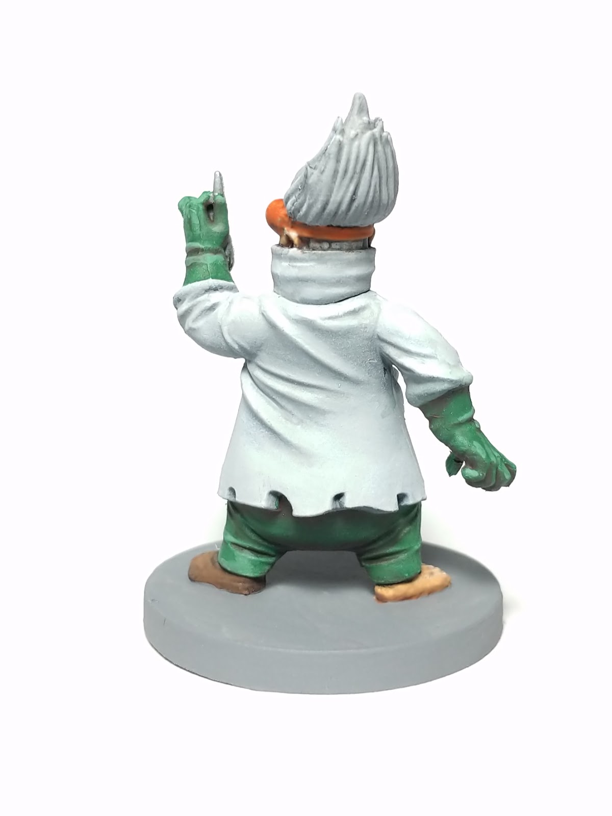
Here is the Dollmaker. For folks who want a larger version of the card art, Plaid Hat has released a free story expansion to Stuffed Fables, and page 3 has a nice view of it. This image also highlights a curious distinction between the card art and the miniature: the card art gives the Dollmaker a face that is either itself a stuffy or at least in a stitched mask, whereas the sculpt looks like a human face complete with nose and ears. Like other painters I've seen online, I decided to paint these areas in flesh tones rather than the orange suggested in the card art. (Also, I'll point out that many images in Stuffed Fables fall into the Gloomhaven trap of using dynamic backlit illustrations that look good on paper but make it very hard to intrerpret what colors to use!)
I continued with two-brush blending after working on the Snatcher. I am happy with the result for the Dollmaker, but it was a little frustrating to paint him because, after spending an hour or two on the lab coat, I set it down next to a zenithally primed figure and found almost no difference. To be clear, there is a difference, but it sure is subtle. For tabletop play, I probably could have left it as naked primer and nobody would have been the wiser!
What figure was he next to on the painting table? None other than the unnerving penultimate boss, Skreela.


Skreela's card art is more monochromatic, with pale barely-purple flesh being practically the same tone as the top of her frock, and the dress/nightshirt itself being another variation on pale purple. I futzed around a lot with skin tones before settling on something colder and more saturated, a cold blue tone.
I painted the hair as described above and used two-brush blending on the rest. It wasn't until I was getting ready to varnish the bosses that I looked again at her dress and thought it was too clean. The card art clearly has her looking dirty (and more manic, but part of me is glad the miniature isn't as creepy as the card art in this regard). Empowered by my experience with rust and streaks, I decided to add some dirt to her dress, although I laid down a coat of gloss varnish first in case I needed to wipe away mistakes. I used a bit of foam that I had sitting on my painting desk and used that to stipple on two colors of dirt. I forgot to take a "before" picture, but I think the result is good. Perhaps the dirt is a bit too regular around the back, and I could still add some more spots further up to break the circular pattern.
I have a few options for what I might paint next, but I am definitely thinking more about playing with weathering effects. Regular readers know that I'm a fan of Dr. Faust's Painting Clinic, and I've seen him do some amazing work with weathering products, especially on models. For miniatures, maybe it's overkill. It makes me remember to stop and count my blessings that I can afford to spend a few bucks on streaking grime just to try it out.
Finally, here comes the big bad:


That's Crepitus, whose card art is, once again, strongly backlit. I have seen other reasonable interpretations of his palette, but I decided to go for a very limited color selection. It took several trials to get a flesh color I was happy with, but once I nailed that, the rest came pretty easily. Two-brush blending continued to be the technique here, with the addition of layering to bring out the highlights. At the very end, just before varnishing (as with Skreela above), I decided to add a modicum of what Sorastro calls "tonal variation" by brushing some thinned purple paint into some of the deeper folds and recesses. It was a subtle improvement and something I want to explore more in other sets.

In the continuing saga of camera problems, I was excited to see Ghool post an informative video for his patrons about how he photographs his miniatures. My lovely wife helped me dig up an old digital camera that supports manual white balance along with other materials to recreate Ghool's technique. I spent some time on that this morning, and I didn't have any luck at all, mostly because the old Canon wouldn't focus on a miniature. However, the video did help me understand a few things I really didn't before. One is that the ISO should be low, since I am photographing still items. The other is that the mysterious lines I've been seeing in my photographs are coming from my lamp. The bulb in my painting lamp is flickering imperceptibly, but when combined with the capture rate of my smartphone camera, the result is shaded bands. Of course! I tried a few other bulbs that we had around the house, but none of them are "natural daylight" like the one I use—they were all too warm. Maybe I'll shop around for a better painting lamp or bulb (again, counting my blessings).
In the meantime, my new knowledge helped me sort out a workaround that I used in most of the pictures you see above. OpenCamera allows me to manually adjust the ISO as well as the shutter speed and white balance via sliders. Setting the ISO to 50 and looking at my minis on white paper, I was able to see the banding effect, similar to what I was seeing with the default camera app. However, as I increased the shutter speed, the bands narrowed and, eventually, disappeared. By fiddling with the shutter speed and white balance setting, I was able to get the minis on-screen to look very much like the ones sitting in front of me. Huzzah! OpenCamera only keeps those settings for one shot by default, but there is a lock feature to prevent them from being reset. Huzzah! Unfortunately, if you leave the application—for example, to look at photos or check an email— the lock is lost. That's why a few of the pictures above have perceptibly different background hues: the camera switched to automatic mode without my noticing. Still, progress is progress.
One of Ghool's tips was to shoot on black backgrounds. Toward the end of my shooting this morning, I decided to try that, prompted in part by the difficulty I had getting any kind of reasonable settings for that mostly-white Dollmaker. Compare:


Here's another experiment, using the crawlies:


The black certainly seems more consistent, whereas you can see above what I was talking about before: the camera dropped my settings between activities, and I didn't quite get the balance of shutter speed and white balance right to get a true white. Maybe I should shoot my next set entirely on black? At least I now have some stuff black felt that I could try, since it's one of the many materials my wife helped me find.
It's a bit of an epic post. I'm happy with this painted set, and my boys and I are really enjoying Stuffed Fables. I am looking forward to painting figures that don't have quite so many large, round, featureless areas though.
Thanks for reading! As always, feel free to leave a comment.

Great job! I liked so much your post. Thanks!
ReplyDeleteAwesome! Thanks!
ReplyDeleteWhat kind of colors did you used?? Acrylic?
ReplyDeleteYes, I use Vallejo Model Color paints, which are acrylic.
DeleteIt just looks great. Thanks for sharing your great work with us
ReplyDeleteI'm late to the party, but just got the game. Thanks for you inspiration.
ReplyDeleteYou're welcome! I hope you enjoy both the painting and the game!
Delete