Regular readers will know that I've enjoyed painting and playing Massive Darkness. Searching this blog for that title should turn up several posts. I know the game gets flak from some corners of the Internet, but I've logged 32 plays of that game, and my family has enjoyed it. When CMON announced the sequel, with the promise of cleaning up some of the gameplay from the original, I was excited to hear more. I was disappointed to see the "Hellscape" theme. The original was built primarily on classic fantasy tropes, and I was hoping for more of that; fighting angels and demons is less interesting to me. However, the idea of asymmetric heroes intrigued me, and when they added in the Upgrade Pack that lets you use all your Massive Darkness content in Massive Darkness 2, that suddenly seemed like a better deal. I made my decision and backed the project.
Now I have a giant cardboard box in the corner of my office, containing within it several more cardboard boxes filled with too many miniatures. Hooray! I decided to start this set as I did the original back in 2017: the base set heroes. After reading the rules and punching out the tokens, I noticed that the Shaman class can summon two spirits, who are represented by tokens in the base game but have nifty miniatures in the Kickstarter-exclusive Darkbringer set. Who wants to play with tokens when you can have cool miniatures? I decided to add those two spirits to my initial push as well.
As usual, I painted them according to the provided card art. Unfortunately, the cards for most of them cut off around the thighs, but clearly there was full-size art commissioned at some point, because it shows up sometimes in the rulebook and Kickstarter campaign page. A friendly discussion on BoardGameGeek pointed me to the website of Edouard Guiton, who did much of the illustration, and whose page contains the full illustrations. Thanks, Edouard, for posting this! The discussion also pointed me to this incredible effort, which collects all the MD2 characters with their corresponding illustrations in one convenient spreadsheet.
Let's get into it! I will post them in the order I painted them.
 |
| Irk (front) |
 |
| Irk (back) |
First up is Irk the Forest Sprite, which I started with because I think it's
goofy. For some reason, together with undead, skeletons, demons, and fallen angels,
Massive Darkness 2 includes these bizarre round-headed fairies. One needs to warm up the painting process with something. The illustration shows the ... carapace? ... as being very shiny, an iridescent green like a beetle's shell. I've never done any real intentional non-metallic metal before, but I've watched enough Sorastro to know the basic idea is to go from dark darks to light lights. I tried to do that on the green parts, and I think it turned out pretty good without spending inordinate time on it.
Maybe what confuses me most about this sprite is that it's wielding that big sword. Imagine swinging that sword while flying: you yourself would go spinning away from the effort. Something like a spear seems more appropriate, but really, if you can summon fire and ice spirits, why not just focus on that and carry a lucky charm or a wand or something?
Speaking of which...
 |
| Fire Spirit (front) |
 |
| Fire Spirit (back) |
The fire spirit was an interesting challenge to paint. The character art is highly stylized, with the hottest part of the flame being around the face. I think I was able to translate this pretty well into three dimensions.
 |
| Ice Spirit (front/left) |
 |
| Ice Spirit (back/right) |
The ice spirit, like the fire spirit, was fun to paint. Each successive coat of paint really added to the whole thing. When painting more conventional miniatures, you can only work to improve one area at a time. Figures like this, that have the same colors throughout, give a better sense of progress as you work on them.
Both the spirits were pretty badly assembled. In both cases, I filled the gaps and tried to smooth the joins with plastic putty. Part of me wishes I had taken the extra time to get out my milliput and done a finer job. It will only make a difference if the board game is great rather than just fun.
Incidentally, whereas I used zenithal priming on the heroes, I primed the spirits in just plain white. The white from the airbrush was not as bright as I wanted, so I also put on, oh, let's say a million coats of white over that to try to get a clean, non-streaky base. I have on progress shot here, which I think I took after an hour of painting white so I could share it with my brother and question my existence.
My next step worked brilliantly, but I don't have a photographic record of it: I went over the fire spirit again with a warm white (mixing just a little yellow into it) and the ice spirit in cold what (mixing just a little cyan). This made all the difference in the world. Setting the two next to each other, one could already see that one was "hot" and the other was "cold".
 |
| Irk and her Amazing Friends |
That's enough for the Shaman. Let's look at the other heroes.
 |
| Sir Ronen (front) |
 |
| Sir Ronen (back) |
Next up is Sir Ronen. I tackled him next because he seemed pretty straightforward, and I wanted to think of something good to do with his rather plain steel armor. I wanted to use some of the techniques that
Dr. Faust described in a video about a year ago, but I had no luck with that. He is using inks diluted with a little water over the same kind of Vallejo Metal Air that I am using, but I find that my inks get hydrophobic: I lose a lot of control as the ink-water mixture beads up. I ended up mixing in some glaze medium, which helped get some control back, but it still didn't behave like what I see in Dr. Faust's video. He also is using colored inks to great effect, but the card art here didn't suggest a color beyond brown, and I quickly found that adding brown just made it look dirty. I ended up doing an
ad hoc combination of the mixture above, pin washing, my P3 Armor Wash, and a little stippling to add wear.
The real bugger here was the skirt that he's wearing. It is rather dashing, but it's not clear that it's practical. He's a paladin, so maybe it's part of his order. Anyway, it took some time to get a good khaki color and shade it properly, and after a long time working the skirt, it looked okay but uninteresting. Looking at the card art, there's a slight suggestion of an orange fringe on the skirt, though it's hard to tell if it's intended to be part of it or a lighting effect. Adding the little orange fringe on the figure gave it just what it needed.
 |
| Gheta (front) |
 |
| Gheta (back) |
Gheta was fun to paint, with some interesting details, dedication to earth tones, and a big fur cloak. I was probably an hour into painting her when I realized that the sculpt has no left arm at all. My imagination had put an arm under the furs, but then I realized one could also tell a story that this berserker had lost an arm in battle. Either one works, although if I had just one arm, I probably would not choose such an axe.
This was actually the figure that had me looking up the card art since the legs were ambiguous: it was hard to tell what was supposed to be metal armor vs. leather vs. flesh vs. something else. Unfortunately, the card art didn't really help here except in showing that the sculpt seemed to diverge from the card art in the legs.
For the furs, I used the classic quick approach I learned from Sorastro's Wookie videos: wet-blend the highlights and shades and then bring the tone together with a wash. A few touch-ups can be added as needed, but otherwise, that's usually satisfactory.
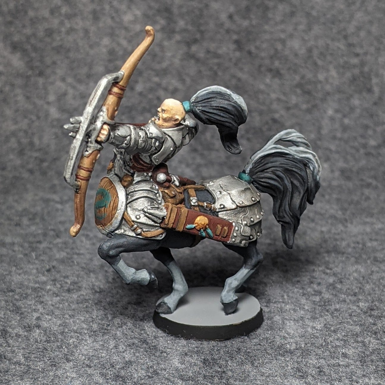
 |
| Nahias (front/right) |
 |
| Nahias (front/left) |
Hey, a centaur hero! Pretty neat! Sure, it's again mixing sylvan and hellish themes, but centaurs are fun. Imagine the big centaur, twice the size of the heroes, imposing like Li'l Ned from the original, charging into battle with a spear and a ... hey ... wait ... an archer? Um, ok. You just... stay back there and shoot arrows then, and we'll send Irk to the front lines with her big sword. (Don't get me started on triple-arrows.)
Nahias is large but was pretty straightforward to paint. Painting horses is hard, but fortunately, Nahias' armor covers up much of what would be the challenging horse parts. I approached the armor like Sir Ronen's, and it's nothing special here. I tried to bring out more of the contrast, but a lot of it, especially on the hindquarters, is just sort of big plates. Fortunately, the contrast of the white streak in the hair and tail draw attention away from that.
I'm proud of not having ruined the shield when freehanding the serpent on it. The shield itself already looked good, and so it was with some trepidation that I came in with the aqua paint. I used advice I've come across many times about freehanding: start with just simple lines, like a skeleton, and work outward from there. I decided to also add a little highlight and shade to it, which gives it a little extra pop without drawing too much attention.
 |
| Feydra (front) |
 |
| Feydra (back) |
I wonder if the narrative designer came up with this character
some velvet morning. The
illustration has Feydra's cloak spread out under her arms, but the sculpt has it flared out with much more gusto. It's really dynamic, as if she has just leaped down from a ledge or maybe is
Naruto-running toward Area 51. In any case, from the front, it's a pretty straightforward purple-brown paint job with gunmetal greaves. From the back, though, it was a real challenge. The illustration clearly shows that the inside of the cloak is a muted pink. I struggled to get a good match for the flared-out cloak. Note that, despite it being flared out, all of it is still in shadow if conceived from above. I ended up toning it way down except for the very fringe. At first, I was not very happy with it, but I was tired of repainting it. The more I let it sit, the more it grew on me. Lemons and lemonade.
In any case, one of my favorite parts of this sculpt is how the right side of the cloak is not uniformly open like the left side: it is rippled, and so seen from the back, you can see both the front and back colors of the cloak in an accordion fold.
Also, wearing a mask in a dungeon is like wearing a skirt as a paladin. Sure, it looks cool, but it's like taking a handicap.
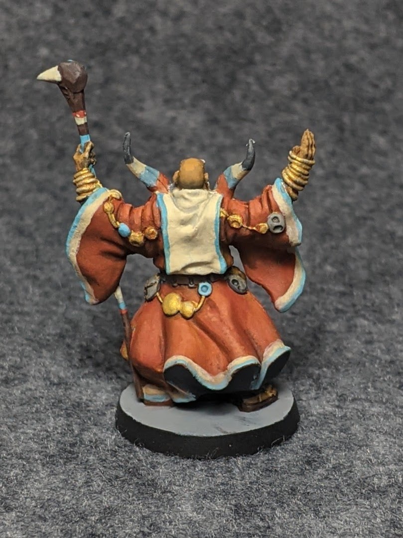
 |
| Mathrin (front) |
 |
| Mathrin (back) |
This wizard was probably the most fun to paint. I saved him for last just in case it was more tedious than fun. These colors are unlike anything else I remember painting, and the patterns of color are much tighter than most things I've painted. I started with the red-orange robes, painting it all in a uniform color. Then, I mixed the yellow for the fringe and laid that down, and finally, the cyan just over the edges. The robes are wonderfully sculpted, and I think the paint job turned out great.
Next, I worked on the curious chestpiece. Fortunately, the sculpt is very generous here: the details and edges are sculpted right in, so it was not as bad to paint as I had feared. The red around the "eyes", for example, is actually a raised ridge, which is much easier to paint cleanly than to freehand symmetric rectangles.
The triangles on his stole were tricky. I put together a mix of yellow and grey, got out one of my finest detail brushes, and started by laying regular horizontal lines across the front. Then, my plan was to lay down diagonal lines across the whole thing for perfect symmetry, but I started with some triangles to get a feel for it, since I still had the base color to cover up any mistakes. I ended up just doing triangles all the way up, occasionally extending guidelines diagonally, but trying to get something visually interesting rather than completely regular. After all, there's no adjusting paint after its laid down, and I was really hoping to get this in one pass. With a few touch-ups in the base color, I think it turned out well.
The back was another story It tried the same technique, but notice the wrinkles on the back. Getting a "straight" line across the back was difficult. In fact, I suggest that the illusion may have been impossible because I don't think cloth can do what is sculpted into the back of the stole. I think if you flattened out the shape shown here, it would not have straight edges. In any case, I tried, and it looked terrible, and I painted over it. Rather than fight with triangles over those folds, I decided to take a trick from Sir Ronen that matched the robe on Mathrin here: use some edging for easy visual interest without risking having to repaint that whole section a third time. The results are much less flashy than the front, but I think it looks good and am happy with my choice.
 |
| Base Set Heroes and Summoned Spirits |
That's all for today. I'm excited to get the game to the table with painted heroes, but it looks like that may not be this weekend—at least not a six-player game with the whole family. Now, I'll need to go back to my giant cardboard box and figure out who gets painted next.


Thanks for this. I'm going to attempt to paint mine using Army Painter's Speedpaint range. If they turn out as good as yours I'll be happy :)
ReplyDeleteHave fun! I found this set enjoyable to paint overall. Feel free to post a link to your finished project when you're done!
Delete