Saturday, June 10, 2017

Painting Descent, Part 2: The Heroes

I am happy to report on the completion of my Descent: Journeys in the Dark, 2nd Edition miniature painting project—a project that spanned a few other painting projects in between! In this part, I report on the heroes, following up on my completion of the monsters back in March. For the heroes, I prioritized the painting of the three that we wanted to use as heroes first; the low priority of the rest is the main reason it took so long to finish the set.

Oblig. Box Art Photo. As per FFG/Runebound tradition, none of the pictured characters are in the box.
After trimming off mold lines, I decided to prime all the heroes using Vallejo Grey Surface Primer, applying by brush as per Ghool's video tutorial. I used two coats to get a good, clean layer of primer over the plastic. For my overall approach, I was inspired by Sorastro's painting techniques, where he generally uses a base coat, wash, and highlight. He pays great attention to detail to get a very high tabletop quality; I was more interested in getting decent results to the table quickly. That is, looking at it as a design problem, my fitness function was essentially "Is this model painted well enough that I can be proud of it when it hits the table, without spending inordinate effort?"

In Sorastro's newer videos, he has been using zenithal priming, which is a form of pre-shading. This involves priming the figure black, then laying down a layer of grey primer from about 45 degrees, and then a layer of white primer from above. This looks like a nice way to start a model, but from what I understand, it requires an airbrush, and that's an investment I have not been willing to make. One of the main reasons I have avoided thinking about this is that it would require me to clean the garage workbench to make room for a spray station. Before he got into zenithal priming, however, Sorastro mentioned a technique in his Jain Fairwood video where he primes in white and then applies a thin wash over the model. The result is similar in spirit to zenithal priming: it pre-shades the recesses. I tried this, using my homemade ink wash based on Lester Bursley's recipe, starting with Avric Albright. The result was immediately recognizable as a failure. The Vallejo Surface Primer, when brushed on, has strange hyrdophobic properties. It's a bit like painting Bones plastic, if you've ever had that experience: the paint pulls into pools on the base coat, requiring multiple layers just to achieve coverage. I asked Ghool about this online, and he confirmed that this is how it goes with brush-on, although the same product behaves differently when airbrushed on. So, what happened with the ink wash was that it beaded up rather than flowing into recesses. I don't have any photographs of what happened to the miniature because I immediately grabbed a big brush of water and cleaned the stuff off the miniature as best as I could. There were still some faint ink tide marks, but these were easily covered by the real base coat.

There was another surprise regarding this new priming technique. Based on my experience with the attempted pre-shade, I knew I had to use thicker paint than usual to get good coverage on the base coat because of the strange primer properties. I painted a few heroes and the results were fine. About halfway through is when I interrupted this set to work on some others, and I used the same priming approach except that I used only one coat instead of two. On those models, the paint behaved much more nicely, without so much beading. I am still not sure if I am seeing a property of having used two layers of primer or something else about the plastic or the environment. I returned to spray priming for my next painting project since the weather was just right for it, but hopefully I can figure out all the variables here sometime.

OK, that's all the background and context. Let's move on to the figures!
I started with Leoric of the Book, the character I intended to use for our Road to Legend tutorial campaign. I am quite happy with the results, and I think it's some of my better work. Priming in grey, instead of the black gesso I have been using, made it much easier to get bright whites on Leoric's robes and tassels. Miniature painters know that eyes are troublesome; I watched Sorastro's video for inspiration and noticed that he didn't paint the eyes at all. I decided to do the same, and I think it gives the figure a great haughty expression, with his head tilted back, as if he's looking down his nose at some measly goblin archer.

Next up is Avric Albright, the cleric. I think I did a nice job with his cloak, and the checkerboard detailing on it really helps sell it. I spent some time on the shield trying to emphasize how light reflects off of metals, but it's really too subtle to show up here; using metallic paints (TMM, True Metallic Metals), it didn't really matter as much as if I was doing it without (NMM, Non-Metallic Metals). For Avric also, I did not paint his eyes, obscured as they are behind his helmet, and I think that was fine. Longtime readers may recognize that this is uncharacteristic for me not to paint the eyes at all. It's a small thing, but it was something interesting for me to consider.

My son played Syndrael, the elf knight, for our campaign. Of these three, she was the most straightforward to paint, since she's mostly gold armor and green cloth. The hardest part was matching the tones, which for the armor was done by mixing metallic gold paint with nonmetallic yellows and beige. Once again, no eyes, but with a slightly different stories. I painted the eyes on Syndrael, and they came out kind of buggy. Putting her next to Avric and Leoric, the difference was noticeable, so I ended up painting over them with flesh colors, leaving her with a somewhat distant facial expression.

I will make a quick note about the basing here, in case I ever need to come back to my own notes and base additional Descent figures. The bases were all done with a mix of fine, medium, and coarse ballast, about 4:2:1 ratio. This was painted black and drybrushed up to medium or light brown. Flocking was done with a 50/50 blend of burnt grass and medium green fine turf. I like how the turf suggests a combination of low-growing greenery, and on top of this, I added static grass to most of the heroes. A mix of green and black tea leaves was used for the rest of the flock; these were taken from teabags, which are finely cut and contain a nice assortment of tones and shapes.
My son wasn't so happy with Syndrael, so the next one I painted was Grisbane the Thirsty, the other warrior from the base set. I am quite happy with the results here too. Like all the figures, I didn't pick the paint scheme; I just tried to match what was on the character art. Still, I think his mix of reds and browns turned out great, contrasting against the grey hair and metallic highlights. I spent more time on his face than any other, glazing on a reddish hue to his nose and cheeks.

The first of the scouts from the base set is Tomble Burrowell. His color scheme is a lot like Grisban's, with reds, browns, and bright accents. I mentioned this in my previous painting post about the Visions of Dawn expansion, but it was kind of hard to be motivated to paint the scouts. For three players, I'm inclined toward a party that includes Fighter, Healer, and Spellcaster, which leaves Rogues out of the mix as an optional fourth. Maybe once this current campaign is done we'll try a different mix; although the Road to Legend app allows for multiple campaigns at once, that does require tedious swapping of cards, a process that drained a lot of my energy for Imperial Assault back when I finished that and tried running two campaigns at once. Honestly, I don't know if these Scouts will ever hit the table if the Imperial Assault co-op app is released before our Descent campaign is finished, since I'm hopeful that it will breathe new life into IA and allow me to bring those minis back to the table.

Let me leave myself a quick note here about these photographs. These were all taken in the morning (which means without direct sunlight into my office, which has south and west windows) from my lightbox. I used the same postprocessing that I mentioned in the Visions of Dawn heroes post, namely, that I boosted the whites using the Google Photos "white" slider in their Web-based image editor. I believe that these photos are quite good representations of the actual miniature.
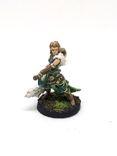
After finishing the Road to Legend mini-campaign, my wife and son were switching to characters from Visions of Dawn for the full campaign. I thought about keeping Leoric since I quite enjoyed him, and I was not so interested in the abilities of Master Thorn—the Mage from Visions of Dawn. Returning to the base set, I realized that Widow Tarha could be a fun character to play as a Runemaster, so I painted her up, and it's been a blast. Her re-roll ability is priceless, especially with the 1/6 chance of a miss that plagues Descent (and was cleverly shifted away to a defensive ability in Imperial Assault). I think the fiture turned out quite nice, with a lot of contrast between the colors. Perhaps I could have taken her skin highlights up higher, since it does look a bit dull compared to the rest of her. The fur headdress was painted bright white and then toned down with a series of washes. Again, in retrospect, I could have done something more elegant here by blending different base colors on the headdress and then using washes to unite the colors; I'm sure this perspective is influenced by some of Sorastro's latest videos where he uses this approach on classic Star Wars characters such as the Rancor and Jabba the Hutt.

Here is the other scout: Jain Fairwood. Despite my uncertainty about the future of these scouts, I do think that the result is good here. In retrospect, I could have probably taken the highlights on the cloak and hair even higher. I had a hard time with the part of her cloak that falls down over her back since it is rather flat. It took several layers of highlights and base color glazes to get something I deemed acceptable. The final effect is somewhat mottled, which is an artifact of having done an ad hoc mix of layering, wet blending, and feathering.

Finally, here's Ashrian, who I painted last, giving her the unenviable position of "I'm ready to be done" paint job. Her pose is quite dynamic and interesting, but the either the sculpt was sloppy or the casting was poor. She was covered in awkward, unreachable mold lines, including across the middle of her hair. I think I have mentioned before that I believe Descent can be credited with some of the growth of miniature board games and the painting hobby, leading to the massive success of Kickstarter projects like CMON's, It seemed to me like the average quality of the Visions of Dawn miniatures was much higher than the base set characters; is this a reflection of Fantasy Flight's recognition of the value of hobbyist painters, or perhaps market-driven improvements in miniature production technology? I don't know that anyone has a definitive public answer, and I know that FFG is generally very quiet about their products and production.

In any case, Ashrian turned out fine. I could have added a bit more detail, but the result is a fair interpretation. The hair on the card art is a bit more yellow than I have here. Who will ever play her, though, when we have Ispher? Still, she passes my fitness function.

Let's go journey in the dark!
I am happy with the result of this set, and they look good on the table. We have never played Descent by the classic rules, only playing with the co-op app. The game takes just slightly longer than I would like, but this is due to family constraints of trying to fit it between when the younger kids go to bed and before the oldest one does. My second son has shifted his bedtime in the last two few weeks as well, so I don't know quite what that means for our campaign.

I am glad I followed through with the idea of using the same fundamental technique for all the characters. I wasn't a zealot about it, using a bit of wet-blending or two-brush blending when it seemed appropriate. Base/wash/highlight worked well over the light grey primer. It's not clear that it saved me much time over working up from black primer except on those heroes with a lot of white showing, such as Leoric and Widow Tarha.

It's a good feeling to finish a set like this and know that I've created some interesting art that enhances my family's enjoyment of our boardgaming hobby. Thanks for reading!

Thursday, June 8, 2017

Observing a critique in a freshmen-level figure drawing class

Almost ten years ago, I participated in an NSF-sponsored workshop on studio-based learning (SBL) for computer science education. Briefly, this technique is inspired by the pedagogy of traditional studio disciplines such as art and architecture; it is characterized by the crits (critiques) through which students present artifacts that represent their understanding, formally and informally, and they receive feedback from peers and experts. Participating in the workshop was highly influential on me as a young assistant professor, both for the content and for the professionalization: I was able to see how the workshop was run and spend a lot of time talking to educators—new and seasoned—from all over the world. I wrote a few scholarly articles on SBL, and I'm a little disappointed that it didn't become more of a movement. The old Web site is gone, and there are not many new publications exploring this approach. I suspect it will be another blip on the historic-pedagogic radar, but that does not take away from the positive impact it has had, and continues to have, on those of us who follow it.

About two weeks ago, I ran into a friend of mine who teaches at the BSU Honors College, and we got to talking about effective teaching techniques for engaging honors students. Students have to be bright to get into the Honors College of course, but this means many of them have developed bad intellectual habits: they got through K-12 by being smart, not by being diligent. In particular, I told him about how I have my students bring posters that represent their week's efforts, and we stick these to the wall for group discussion; I want more students to engage more authentically with the work that is shown, to explore the connections among ideas, where many of them tend to sit back and stay quiet. My friend suggested that I should go observe a crit in an art class. Of course I should! I have internalized much of the pedagogy of SBL, but I have spent very little time building an understanding of where it comes from. I did observe informal crits in a friend's animation class a few years ago, but I had never seen a formal crit. I had lunch with a different colleague later that day, and who should enter the restaurant but my friend Barbara, who is an art professor! I hopped up and asked if she was teaching any summer courses and whether I could observe a formal critique. She was happy to have me, and so today I am sharing my notes from observing Monday's class.

This summer, Barbara is teaching Figure Drawing, a freshmen-level class for art majors. It is a foundations course taken by all art majors regardless of intended specialization. She was apologetic about them being freshmen, so they themselves were new to the process of giving and receiving feedback through crits; however, this is exactly what I wanted to see, since I was more interested in how she scaffolded their learning about this rather than what they already knew about it. If I used any of these techniques with my Computer Science majors or interdisciplinary courses, odds are it would be brand new to these students as well.

That should give you enough of a background and context for the following notes. I will share my observations of what I saw along with some reflections of what I think, along with notes about how this might be useful for my teaching.

The format crit took place in a different space than their usual classroom. In the hallway outside the School of Art administrative offices is a large, white, bracket-shaped ("[") wall designed to have work pinned to it. The twelve students, the instructor, and I sat on the inside of this wall; the students tacked their work to the wall, along with a small paper showing their name. The particular work being shown was a pair of self-portraits, one a value study from earlier in the semester, and the other a contour drawing. I don't think I had ever seen a contour drawing before, and it got me thinking about how I might use the concept of secondary contours in my miniature painting.

One of the first things I noticed was the obvious variety in outcomes. Some of the work displayed high standards of technical skill, conceptualization, and execution; others were amateurish in comparison. As I mentioned, this course is taken by all art majors regardless of specialization, and so I assumed I was seeing differences in, say, someone focused on drawing vs someone focused on ceramics. Still, I think it is noteworthy, and it's definitely relevant to my own courses: students always come in with a range of backgrounds, skills, experiences, and subjective misconceptions. I saw some students putting up their work, and so I also noticed that even the best among these drawings did not really look like their subjects: a student with a pocked face is shown with a clear complexion; a student with squat, square features is shown with more elegant proportions. I do now know, but I am curious, whether this was because the students were studying the ideal proportions of human faces, or whether I was getting a glimpse of how the students saw themselves. I am less certain what this property means for my work, since I don't ask explicitly for self-portraits, but given that work will always reflect its creator, I wonder if there's something there to draw upon.

Barbara gave a bit of direction as students posted their work, telling the students to spread their work out horizontally rather than posting them low near the floor, and to place the two portraits next to each other. Once everything was in place, she distributed a worksheet to each student. The top third of the sheet contained three questions for the artist, some dealing with technical aspects of the work and some dealing with aesthetic and narrative aspects. She gave them a few minutes to complete this top portion, then collected the sheets, shuffled, and redistributed them; by this mechanism students were assigned a peer's work to critique. This surprised me, since naively I had pictured all the critiques being communal, that everyone would look at everyone's work, as I do it in my game design class or during the poster session-style review of the two-week project in CS222. Once the worksheets were redistributed, students' critiques were guided by the bottom two-thirds, which included five questions for the critic. These questions again included technical and narrative qualities of the work, and Barbara reminded the students that these aligned with the learning objectives of the assignments. The students had fifteen minutes to write their comments. Even though Barbara had told them they should get up and observe the work both from near and far, about halfway through, she had to remind them again to get up off of their comfortable beanbag chairs and walk up to the work.

As I was watching them work, I thought about how some of this could have been done beforehand, especially the artist's reflections. However, I suspect that doing this at the beginning of the meeting helped prime students to think critically about their work. The papers provide a convenient, tangible means of assigning critics, and they also give the instructor something concrete to collect and mark. I could imagine doing something like this for the CS222 two-week project evaluation, which for the past few semesters I have done as a poster session. I encourage students to view each others' teams work, and I model this behavior myself. Practically everyone is engaged, but in retrospect, they don't have concrete scaffolding in how to discuss the work. I think they talk about the kinds of things we have discussed in class, that are covered in the book, and that I have presented in my formal presentations and assignment feedback; I can hear them talking about algorithms and design, and students are always eager to ask successful teams, "How did you do that?!" I wonder if random assignment of critiques—with a handout like Barbara's—would add rigor and learning to this experience, or if it would diminish the interest-driven and spontaneous conversations that arise? With the amount of dynamic conversation and chaos in the room, this may be the kind of research question that needs external evaluations or analysis of recorded sessions.

Also during this time, Barbara told me that one of the explicit goals of the formal critique is to help students develop their ability to use the right nomenclature. (I even learned a new word: chiaroscuro!) I acknowledged the sense of this, but it wasn't until a few moments later that I grabbed my notes and pointed this out—that the program has explicit goals about helping students develop the right nomenclature, that the crits can help with this, and that I didn't at first jump on this idea and write it down. Even while compiling my notes for this write-up, I had to rediscover this fact! I think this should not be overlooked, however. I have pointed out several times in discussions, probably in blog posts, and certainly during foundations program assessment in Computer Science, that my sophomore students frequently have very little grasp of the technical terminology of our field. I regularly hear students talk about "if loops" for example, or say "class" when they mean "method" or "object" or even "field". Looking at the pedagogy leading up to my course, however, they have almost no opportunity to develop their use of these terms. I used to have students write lab reports back when I taught the intro course over ten years ago, but I don't think anyone else here has expected their CS students to do so much writing. However, we need to help students develop clear ideas, and communicating these ideas is the best way to identify the holes and misconceptions contained therein. This coming academic year will be another assessment year for my Foundations Curriculum Committee: as long-time chair of this committee, I like to alternate focus between assessment and revision. I will be sure to look more carefully at how we help our students learn to communicate the right ideas, including—naturally—what I can do in CS222 to facilitate this as well.

After the students completed their written critiques, Barbara gave the students a pep talk about how to proceed, as this was their first formal crit. She reminded them that what they are doing is difficult, but that it gets easier the more you do it. She also tells them that each critique should give the artist something concrete that "they can do tonight" to improve the portraits. I noticed that this was not actually one of the explicit questions on the worksheet but rather an emergent property of a successful critique; I wondered if it was purposefully not listed as a question on the worksheet or if this was an oversight.

Barbara chose an ordering to go through the work based on how it was arranged on the walls. The critic stood by the work and introduced it, being invited to either read or summarize the artist's statements from the worksheet; some read, some summarized, and most did a mixture of the two. The critics gave their presentations, with the instructor occasionally interjecting to ask for more specific details or to encourage the right nomenclature. After the critic's presentation (and occasionally during), Barbara turned to the rest of the class and asked whether they agreed or disagreed with the critique. Following this, the artist was invited to respond to the critique, and then they moved on to the next one. I watched about half of the crits before I had to leave, which included what I considered a good range of the output quality. I noticed that Barbara pushed back pretty hard on the bad parts of good work, I suspect because of the promise of real understanding or excellence. I noticed that I do this as well: I will push a bit harder on students who are getting closer to real understanding, whereas those who reject feedback tend to get less of it. I thought that both Barbara's and the critics' feedback was surprisingly gentle to some of the work that was particularly bad. The framing of her questions encouraged positive feedback, which is good, yet I found myself thinking, "Is no one else going to point out that this guy's eyes are 2/3 of the way up his head?" This may be because no one wanted to really hold a peer's feet to the fire, or because they are freshmen, or because of cultural differences; I cannot help but think a room of Computer Science students would be less likely to let stand something with obvious structural insufficiency.

The students were getting pretty punch by four or five crits in. I happen to know that these students are taking a boatload of summer art courses, which means they are all carrying physically and intellectually brutal schedules. Even with just twelve students, going person-by-person through a crit means that you're fighting against attention span. Perhaps students later in the program simply become more accustomed or enculturated into this.

I am very grateful to Barbara and the students for welcoming me as an observer to this class. I believe I have captured all of my important observations into these notes, and I hope that they might be useful to you, dear reader, even you are just Future Me. In the meantime, I'm going to read some more about secondary contours and chiaroscuro. Thanks for reading!

Saturday, June 3, 2017

An afternoon with ICRPG

I spent some time with my boys playing Index Card RPG this afternoon. ICRPG is a new RPG published by Runehammer Games. It is the work of Hankerin Ferinale (NB: yes, I am looking for an excuse to cite him by that name in a research paper), who is most well known for his YouTube series, Drunkens and Dragons. I've watched a few of his videos, mostly those about storytelling and DMing. Even if you're not into the hobby, his recollection and historical overview of Mazes & Monsters provides a nice, short  insight into Hank's background, style, and ethos. Index Card RPG is thus named because it is designed for use with illustrated index cards in place of grids, terrain, or theater of the mind. You can get a quick look at it in this video. I was immediately intrigued by the abstract use of space presented in ICRPG, and so when Hank announced the release of his ICRPG Core Rulebook, I decided to pick it up. The book distills a lot of the ideas that are covered in the Drunkens & Dragons YouTube series, presenting them in a concise manner with explicit encouragement to pick and choose parts of the system that are of interest.

One of the hallmarks of the ICRPG system is the use of Effort. For those familiar with Dungeons & Dragons and its relatives, it is as if all tasks have "hit points" that must be overcome. For example, picking a lock is not a matter of just passing a check: a player must pass the check and then roll effort to see how much progress is made on the lockpicking. This combines with fast-paced, round-robin turns to give a very different sense of time than in conventional tabletop RPGs. The Core Rulebook also includes a few other tricks and suggestions to add tension to adventures, many of which come back to this concept of spending sustained effort on tasks besides just whacking ogres.

The Core Rulebook includes three "trials," which are relatively simple scenarios that a group or an individual can run through just to get a feel for how all the pieces fit together. This sounded good to me, so I rounded up a some of my boys and we set to character creation. The trials could be done without any manipulatives, but the players all enjoyed picking out miniatures from their collection for themselves, and I spontaneously created two index card drawings to provide some of the setting.

Although the Core Rulebook includes some suggestions for a sword-and-sorcery fantasy world as well as a futuristic science-fantasy world, I decided to let my boys approach it carte blanche; after all, the goal here was to get a sense of the system and have some fun, not to start worldbuilding or begin an epic campaign. Character creation took about an hour, but this was really due to distractions and the kids' ages, and my need to explain all the rules, since the youngest of the three players does not read yet. The trial itself took about another hour.

Boy #1 created Kartlack, a mantid soldier/guard. This guy reads a lot, and I don't know if he picked up "mantid" from one of his books, but it was essentially a humanoid mantis. The first step of character creation is to assign six points to core attributes, and he allocated points to strength, dexterity, constitution, armor, basic work, and weapon damage. You can see that ICRPG unapologetically reuses the attribute system from Dungeons & Dragons, which makes for easy pick-up to someone like me who spent many years with D&D. We decided that mantids should get a bioform ("race") bonus to armor and dexterity. For his starting loot, he wanted something to increase his constitution, but the ICRPG Core Rules starter loot "Trusty Mug" didn't match his character concept: would a mantid even drink from a mug? I suggested a box of grasshoppers, such that if Kartlack eats one each day, he stays tough and healthy, and so was born the Hopper Box. Kartlack also started with miner's gear, steel claw sheathes as weapons, and 50 coins. The player explained that Kartlack's people lived underground like an ant colony, and hence the miner's gear. I pointed out—to a kid who honestly knows more about insects than I do—that praying mantises don't live underground. He justified it by pointing out that it's just a fantasy game, so they could live underground. How about that?

Boy #2 created Klac, the kobold healer. I think this may have been the name of one of the miniatures they have acquired from a board game or the local game shop, but this was not clear to me. The player put points into dexterity, wisdom, basic work, and magic effect. Kobolds also were not defined in the ICRPG Core Rules, so we decided that he'd get a bonus dexterity and armor, for his scaly skin. He took a Healing Touch skill, as described in the Core Rules Priest class, along with a dagger, healing herbs, and a hiding cloak. We made up those last two items, the former granting +3 Wisdom to heal checks and the latter giving +3 Dexterity to hiding checks.

Boy #3 is a preschooler, and he really wanted to join in. His inspiration was to be like a character from The Adventures of Loupio: The Tournament, a story where young squires form teams and compete in a tournament. I asked if he wanted to be a child in the game, but he said he wanted to be an adult. Unfortunately, we couldn't find our copy of the book when he looked for it to show me the inspiration. I asked if his character was a knight or a page, but he insisted that these were not right. In the end, Boy #3 chose the class "Grown Up", which quite pleased him. He ended up with Eagle, the human grown-up, with one point each in strength, dexterity, constitution, intelligence, wisdom, and charisma. As a human, we gave him a +1 wisdom and a +1 to weapons use. (Actually, the rulebook suggests +1 intelligence, but I remembered it wrong at the time.) His starting loot and equipment comprised an armor kit, armor, a bow, and a longsword.

That was a lot of words with no pictures. Here are the character sheets.
I chose the first trial presented in the book, which has the players escape from a burning complex. I suspect the trial was not intended for a group of three, but given their ages and inexperience, I was fine if we traded away some tension. The trial has three parts: overcoming or avoiding two archers, dodging crumbling walls, and getting past a locked gate while poison vapors threaten to overcome you. In the first part, Kartlack charged the archers while Klac hid and healed and Eagle fired volleys of arrows. Everyone got to feel like they contributed, and Kartlack even rolled a critical hit. The second part was a simple series of dexterity checks, which at this point the players had a handle on. The last part was interesting, as it was the first time they had to deal with Effort, which I described above. Klac went first and decided to start picking the lock on the gate, and he succeeded but only rolled two effort on the attempt for a task that would need ten. Kartlack tried to help but, with his low dexterity, failed to make progress. Eagle decided to try climbing the wall but could not get a foothold (i.e. failed his check). On Klac's next turn, I explained that he could keep working on the lock, but he was confused: hadn't he already picked it? I explained again that he would need to get a total of ten effort to finish the job, pointing out the d10 I had set out to track his progress. Now he understood, and he and Kartlack both tried to finish the job. Better than that, the players all decided to work together toward this one goal rather than having one trying in vain to climb the wall. A few attempts later and the lock was open, the heroes winning the day.

I asked the boys what they thought about the game, but they sort of fogged up at the question, so I asked instead what parts they especially liked. Boy #3 said he liked that no one got killed, paused, and then added, "except the evil guys." Boy #2 told me that it was fun getting through the wall. This was interesting to me since this was a non-combat conflict, but they still enjoyed having to overcome the obstacle while being in danger from the airborne poison. Boy #1 astutely observed that the increasing difficulty was enjoyable. I hadn't mentioned it above, but each scenario has a Target number that is used for all rolls: combat, dodging, picking locks, climbing—these are all made at the same target. I've never played a game with this approach, but it really was smooth as silk, speeding up play. The three encounters that made up the trial used Targets 10, 11, and 12, and Boy #1 has a good enough intuition for math to see how this increased the tension and excitement.

I asked them then if there was anything that they didn't like. Boy #2 would have liked more enemies, more combat, and he thought that a literal dungeon would be fun. Dungeons feel so cliche to me, but of course, he's a little guy: he would be perfectly happy with a senseless underground romp. I should make one. Boy #1 said that he missed the accurate sense of distance one has in games like Frostgrave, which we played some months ago, or miniature-based boardgames like Descent. I thought this was interesting since I found the loose, gridless, abstract space to be quite freeing, but of course the trial did not really express that: there was neither vastness nor claustrophobia in the trial, and it really could have been played just as well on some Descent tiles as anything. I bring this up to say that even though I think we all got a good understanding of the mechanics of ICRPG, I don't think we got a full picture of its aesthetics.

I believe this is my first d20. I don't remember where I got it, but I've had it for what seems like forever. Even my captions can be a bit wordy.
Last week, as part of my summer goal to play more tabletop RPGs with my family, I played a session of The Princes' Kingdom with my two older boys. I had played this once before, many years ago, and had a desire to try it again. I may tell that tale another day, but I wanted to briefly touch on the contrast between the two rulesets. The Princes' Kingdom uses an interesting conflict resolution system whereby the Guide and the player(s) roll a handful of dice and then take turns "seeing" and "raising", until one side wins. This leads to extended back-and-forth for the conflict, each side narrating what they do to push toward their goals. It's a slow oscillation, however, especially when playing with kids who need to try to imagine and then describe how they are making progress without yet succeeding—something made more difficult when describing non-combat conflicts, such as in our game, when convincing a character to give up a stolen item. This stands in stark contrast to the lightning-fast turns of ICRPG, whose fast and loose structures are clearly designed to keep the game moving. I would be curious to re-run the Princes' Kingdom adventure I designed for ICRPG, since it was really designed as a mystery, but of course it wouldn't be the same with my boys, since they've already solved it!

I had been thinking of dusting off PDQ, which I think is a brilliant little system that I wrote about almost three years ago. I think its learning-from-failure system is more philosophically and pedagogically sound, from the perspective of someone who wants my sons to learn something valuable while they're having fun. ICRPG's take on character advancement is, by contrast, wholly materialist: you are what you have, and you get more by having more. On the other hand, every time I sit with the PDQ rules, I have to re-read them, and designing adventures takes longer than I would like. For Princes' Kingdom too, I had to spend a lot of time reviewing the rules and writing up character templates for my single-island adventure. The fact that ICRPG draws on D&D tropes means that I never have to doubt which attribute I'm testing, and because there are no skills or proficiencies or any of that ephemera, it always comes down to a test of one of the six canonical attributes. I would like to try my hand at putting together some small adventures for ICRPG, since it seems like it might be just the right size to fit into the time I have available for it. Sometimes I'm not sure if it's the tabletop roleplaying that I miss, or the uncountable hours I had to spend on tabletop roleplaying and dungeon-mastering that I miss. There's no DM to tell me if I'm playing my Human Grown-Up correctly. I'll write a blog post about that someday.

I enjoyed reading the ICRPG Core Rules, particularly as someone who reads many more rulebooks than I do play games. The organization is a bit haphazard, but there are lovely thoughtful nuggets within, and I appreciate Hank's visual style. The Game Mastery section has an interesting oath that makes explicit many of the values of being a good GM, and the Dynamic Dice section contains great little tidbits that can be easily added into any tabletop RPG situation. I hope to return to ICRPG again later this summer, and it might even provide a good, lightweight system I could use to introduce fundamentals of RPGs to my game design students. As much as I loved Phoenix: Dawn Command, it was a huge investment of my time to get just half the class through it.

Thanks for reading!

Friday, June 2, 2017

Painting Descent Visions of Dawn, Part 2: The Heroes

Following up on the monsters, I have finally finished up the heroes from the Visions of Dawn expansion to Descent: Journeys In the Dark 2nd edition. I started playing the Road to Legend co-operative app with my wife and son, and we enjoyed the tutorial campaign with a party comprising Leoric of the Book, Syndrael, and Avric Albright. I painted those first so we could start playing while I worked on the rest. We decided to switch up the party as we went into the main campaign, and so now we're using Widow Tarha from the base set along with Ispher and Sir Valadir from Visions of Dawn. I think we're a handful of scenarios in and enjoying the experience. Just this morning, I put the finishing touches on Nara the Fang to wrap up Visions of Dawn, but I still have two heroes left to paint from the base set. I think it's interesting to note that the three last figures have been the Scout archetypes. It seems to me that if you're playing a three-player fantasy game, it's pretty natural to consider that you need a healer and a tank, and then a glass-cannon spellcaster seems a natural third. Then again, this logic completely failed when we played Temple of Elemental Evil, where the rogue was perhaps the MVP because of his ability to remove those deadly traps.

But I digress. On to the Visions of Dawn heroes!

Well, not just yet. Let me mention that I'm still trying to figure out the best way to produce consistent, reliable, accurate photos of my miniatures. I took these pictures in my light box, but the whites were still muted and dull. I used the new levels editor in Google Photos to pop the white level up to the max in post-processing. I think these look just about right.


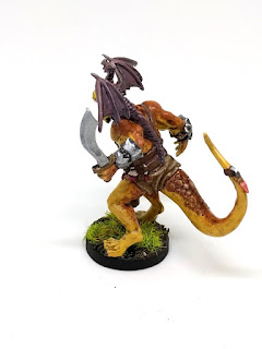
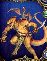
As I mentioned in Part 1, this expansion was a gift from my brother, and his primary motivation was that my family have this guy in our arsenal: Ispher. He has proven to be quite the resilient healer in our campaign so far, and I also think it's a mighty fine paint job. When I first looked at the card art, I got the impression that he was being front-lit by a fire:
It's hard to un-see that, but I suppose it's an artifact of having an orange-yellow front and a dark orange back.

The first step was wet-blending the overall skin tones. Just as Sorastro has started doing more wet-blending, I have also tried to think of ways to hone this skill. Here's a work-in-progress shot from this first step:
That's a pretty nice job, I say, and the later steps of ink wash and adding the scaly details help sell it.

I wanted to add additional spots besides the ones that are sculpted in, and the last time I've done something like this may have been back with my Imperial Assault nexus, where I added stripes to match the card art. I used a thinned sepia ink to add the spots. It turned out fine, but if I did it again, I would use more layers of thinner ink, with more variation in spot intensity.

You can barely see the vials on his belt, but I had never painted anything quite like that before. I was inspired by the techniques shared by Eye of Terror and C'tan. I used white as a basic glass color, which is also what is used in the card art. I thought about trying to tint it with the colors around it, which of course transparent glass would do, but this was the last detail, and I was getting a feeling of diminishing returns.

Overall, I'm quite happy with Ispher. He has a nice sculpt, and the paint scheme on the card art combines yellows and browns in a nice way, offset by his grey-purple dragonet. My only complaint is that he takes up an awful lot of room on the table, so it can be quite tricky to fit him onto the board when there's a melee fracas.

Next up, Sir Valadir:
A good sculptor will tell some kind of story with their work, and I want to take a moment here to share my thoughts about Sir Valadir's story—not having read any of the fiction or fluff around him. This guy is a cocky bastard, but he's talented. His smile tells you that he's ready for battle, and he knows he's going to win. He wears gaudy armor that's more for show than anything: he leaves his arms almost completely unprotected. Neither sheath nor scabbard for Sir Valadir: he carries his sword at the ready, resting it on his unprotected shoulder.

OK, now to the painting. Valadir was a challenge because of all the fiddly details on his armor, but the sculpt was nice and matched the card art almost perfectly. This made it fairly easy to block in the colors and then clean up the shadows and highlights. The four fiery tongues on the top side of the shield were outlined in the sculpt, but the bottom one I freehanded to match the card art. Freehanding is tricky in the best of times, but this was done over sculpted wood texture. I'm glad I added some extra layers and highlights, since my original pass was too dim. Looking at it now, it could probably have had even more highlights added, to help it read from across the table.

Last up is Nara the Fang. Once again, I found this to be a high quality sculpt for a board game miniature. The details were nice, and she's full of character. I'm happy with how the skin came out, even though it's a bit less yellow than the card art. I tried to be very intentional about increasing the highlights and contrast—something that regular readers of my painting reflections will know that I continue to focus on improving. Red is a tricky color to highlight, and maybe I could have taken it a little higher too, but I think it's sufficient here, and the lack of stark highlights implies an appropriate cloth-like texture.

You might be saying to yourself, "Hey, what about Master Thorn, the fourth hero from the expansion?" I already have a nicely-painted Master Thorn from Runebound 3rd Edition, so I didn't see a need for another. It gives me a convenient spare mini for some time when one of my boys wants something to paint.

Thanks for reading!