Showing posts sorted by date for query painting. Sort by relevance Show all posts

Tuesday, December 10, 2024

What we learned in CS222, Fall 2024 edition

My students are currently typing away, writing their responses to the final exam questions for CS222. As per tradition, the first step was to set a 20-minute timer and ask them the list off anything they learned this semester that was related to the course. This was an enthusiastic group with hardly a quiet moment. They listed 130 items in 20 minutes. I gave them each six votes, and these were the top six:

  • TDD (9 votes)
  • SRP (8 votes)
  • Code cleanliness (6 votes)
  • DRY (6 votes)
  • Git (6 votes)
  • GitHub (6 votes)
Here are all the items they listed, together with the number of votes each earned, if any. There some interesting items here that point to interesting stories of personal growth. It was really a fun group of students to work with, even though several of them exhibited some behaviors I still cannot quite explain, such as a failure to take advantage of assignment resubmission opportunities.
  • Flutter (1)
  • Code cleanliness (6)
  • TDD (9)
  • A new sense of pain
  • How to set up Flutter (1)
  • DRY (6)
  • SRP (8)
  • Mob programming (2)
  • Pair programming (1)
  • Git (6)
  • Version control (2)
  • Future builder
  • Setting up your environment
  • Asynchronous programming (1)
  • UI design (3)
  • GitHub (6)
  • Code review (1)
  • Defensive programming
  • Working with APIs (1)
  • Model-View Layers (2)
  • Teamwork (4)
  • Better testing (1)
  • What "testing" is (2)
  • Explaining code with code instead of with comments (1)
  • Understandable and readable code
  • Agile development (1)
  • Naming conventions
  • Functional vs Nonfunctional Requirements
  • User stories (2)
  • Paper prototypinig
  • CRC Cards
  • User acceptance testing
  • Programming paradigms
  • How to write a post-mortem
  • Resume writing
  • Knowing when something is done (3)
  • Debugger (1)
  • Time management (3)
  • Using breakpoints
  • Test coverage (1)
  • Modularization
  • Distribution of work (1)
  • Communication skills (1)
  • Discord
  • Dart
  • commits on git
  • pull using git
  • Flutter doctor
  • pub get
  • Configuring the dart SDK
  • Rolling back commits
  • Checking out commits
  • Going to office hours early
  • Commit conventions
  • CLI tools
  • Don't use strings for everything
  • Structuring essays
  • Enumerated types
  • Sealed classes
  • Better note-taking
  • Humans are creatures of habit
  • Parse JSON data
  • JSON
  • Refactoring (5)
  • How often wikipedia pages change
  • Data tables
  • OOP (2)
  • URL vs URI
  • One wrong letter can lead to the program not working
  • How data are handled in memory
  • FIXME comments (1)
  • Widgets
  • State management
  • Encapsulation (1)
  • Abstraction (2)
  • Presenting projects
  • Coming up with project ideas
  • Reflection (2)
  • pubspec management
  • .env files
  • Hiding files from GitHub
  • Serializing JSON
  • Personal strengths & weaknesses
  • Falling behind sucks
  • Software craftsmanship
  • Work fewer jobs
  • Finding internships
  • Remember to email about accommodations
  • Accepting criticism on resubmissions (1)
  • Procedural programming
  • You don't have to take three finals on one day
  • Painting miniatures
  • GitHub has a comic book
  • Being flexible
  • Dead code
  • Holding each other to standards
  • Bad and good comments
  • Aliasing
  • Reading a textbook thoroughly
  • Rereading
  • No nested loops (no multiple levels of abstraction)
  • Using classes is not the same as OOP (1)
  • SMART
  • A bit about the Gestwicki family
  • Places to eat in NY
  • Getting ink to the front of an Expo marker
  • How to clean a whiteboard properly
  • New York Politics
  • Data structures vs DTOs vs Objects (1)
  • Conditions of satisfaction
  • Setting up ShowAlertDialog
  • Handiling network errors
  • Handling exceptions
  • Build context warnings
  • CORS errors
  • Semantic versioning
  • Dealing with Flutter error reporting
  • Test isolation (1)
  • Don't make multiple network calls when testing
  • Improving test speed
  • Always run all the tests
  • You can test a UI
  • Writing 'expect' statements
  • Running tests on commit
  • Autoformatting in Android Studio
  • Testing in clean environments
  • Creating dart files
  • Hard vs soft warnings
  • Functioning on 0-3 hours of sleep
  • Configuring git committer names

Saturday, March 9, 2024

Painting ISS Vanguard

It has been a long time since I finished a full set of miniatures. I have been painting off and on, but it hasn't been complete sets. For example, my sons and I have painted a few Frosthaven and Oathsworn figures but not all of them. I have some Massive Darkness 2 figures primed that have been sitting on a box awaiting inspiration for some time. 

In any case, I'm here to break the streak with ISS Vanguard. My older boys and I really enjoyed Etherfields. It came with a promotional comic about ISS Vanguard that piqued my interest. Somehow, I heard about how Awaken Realms had re-opened the pledge manager for the game between Wave 1 and Wave 2, so I jumped in. I received my copy many weeks ago, but I knew I did not want to bust it open until we finished Oathsworn. We are now two chapters away from doing so, and so I have finished this core set of figures just in time.

ISS Vanguard Box Art

Most of the things I paint are based on concept art, and I like to match the colors of the figures to the artwork. This is especially important in board games so that figures are easily distinguishable. The eight human figures in ISS Vanguard don't have any published concept art, however, so I had to come up with a different way to handle them. Awaken Realms offers a service where they "sundrop" miniatures, which essentially means that they are given a high-quality wash. Their approach makes it clear that the figures are in pairs, two for each of the four playable sections: security, recon, science, and engineering. I liked the idea of painting them in matching pairs, and searching for inspiration online revealed that many others painters did as well. This Reddit post was my favorite, where the painter featured the distinct section colors on each model but otherwise used a high-contrast scheme with white armor and dark detailing. Coincidentally, a friend shared a video on Facebook last night called, "White plastic and blinking lights: the sci fi toys of the late 1970s and early 1980s." I didn't watch the whole thing, but it did get me reflecting on why I believed that white armor with bright colors should match a science fiction setting.

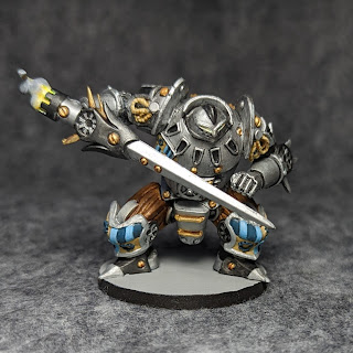
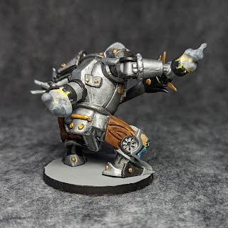
The figures were slightly frustrating to paint. There are many fiddly details on the armor, but not all of it is meaningful. It seems like the kind of thing that would look great when sundropping because that leaves it as monochromatic detail without having to be specific about what pieces logically or thematically connect. I used the aforementioned Reddit post regularly to try to plan out where I wanted splashes of color. There are a few parts that I would consider recoloring if I had the paints on hand, but a lot of the colors were custom mixes; it wasn't worth the risk of having a bad match to recolor it.

I used zenithal priming from the airbrush to prep the figures. I then painted all of them with a slightly warm off-white color, mostly white with a dot of grey and of buff. I used a wash over the whole figure to darken the recesses, then hit the highlights with the off-white armor color.

Let's look at the figures in pairs.

Engineering Section

All miniature painters know that yellow is a challenging color. Fortunately, a white undercoat made it manageable. The one on the left could probably use slightly more yellow, but I do like how it looks in isolation, and one will never have both of these out in the same mission anyway.

Security Section

I thought a lot about whether the little "pet" on the left should be white like the armor or a different color for contrast. I ended up keeping it white to suggest that it's made of the same stuff as the bulk of the armor. 

I like the poses of these two. These figures all make good use of scenic bases. Part of me prefers blank bases, since I can then decide whether or not I want to add features and suggest that the characters are in particular settings, as I did most elaborately in my Temple of Elemental Evil set... whose images sadly seems to have been eaten by a grue, in a horrible example of why you should not trust "the cloud." Here, however, we can see that a pose like that recon figure on the right would really not be possible any other way. The engagement with the scenery makes it worthwhile in a way that those engineering figures feel more like it's in the way. 

Recon Section

The Recon Section also has wonderful, dynamic poses. I was worried that the smokey jet trail of the one on the right might be too much, but I think it turned out fine. I chose yellow for the flowery thing on the left figure in part to complement the dark blue of the strap and mask details and partially so that it has similar colors to the jetpack character

Science Section

The yellow figures may have taken the most time because of the troubles getting yellow to be bright enough, but the Science Section was awfully close because of all the stuff in their scenes. I had some similar thoughts about the claw arm as the security section's pet, and I ended up going the same way here: if white plastic is what they're using to build lightweight rigid armor, then let's use it for the claw arm and the pets, too.

The alien biomatter being picked up by the one on the right looked fungous, so I picked out some colors inspired by that. Of course, a giant mushroom here on earth would not also have green leaves sticking out of it. 

ISS Vanguard (?)

The last figure in the box is a big space station. I presume it is the titular ISS Vanguard, but the parts of the rulebook that I have read don't actually reference it at all. It's not clear to me if this is used in play or not. I wish it did, though, since that would have given me some idea of how much effort I should spend painting it.

As with the human characters, I looked around online and found a few ideas for painting this piece. I kept the "nearly white with spots of color" motif. One of the challenges here is that the way a space station would be lit is quite different from how an away team would be, but I didn't want to paint it so starkly. I ended up using a cold off-white here to differentiate it subtly from the warm off-white of the characters. A wash deepened some of the recesses, then some highlights and spot colors. It's fine. I waffled a bit on whether to just paint over the silly translucent bit, but I chose against it in part because I have no idea if it is significant to the story. Who knows, maybe the campaign plot hinges on understanding that people are using pure translucent blue as a power source? I wanted the blue to match the beautiful tone used on the box cover, but I didn't quite get it.  It's not purple enough, but it does match the translucent parts.

All Eight Characters

Thanks for checking out the photos and the story here. I'll include some more individual pictures below for people who want to see more detail, including the backs. 


Sunday, January 1, 2023

The Games of 2022

EDIT (Jan 13, 2023): It turns out that a subtle bug in the BGG for Android app prevented most of my plays from being properly logged after December 23. I have worked around the issue, and it has required me to update parts of this blog post.


It's time for my annual tradition of reflecting on the year's board games. I logged 462 plays in 2022, which is on par with 2021. Those numbers are still smaller than 2020, which of course was an unusual year. Also, all the family now enjoys playing larger and longer games. My youngest son is seven, and he's never asking to play Reiner Knizia's Flea Circus any more: he wants to play Clank or his recent favorites, Castles of Mad King Ludwig and even Rising Sun. I was not very good about hosting Guys' Games Nights this year, despite having told multiple people that I really wanted to do this. There are some guys in town whose company I truly enjoy, whom I haven't seen in a long time, and for whom board games are what brings us together. I need to do better with this in 2023.

In my annual blog posts, I usually report on the games that I played at least ten times during the previous year. This year, there are some interesting ones just under that threshold, so I will go down a little further into the rabbit hole.

  • Race for the Galaxy (44)
  • Terraforming Mars: Ares Expedition (31)
  • Downforce (27)
  • My City (25)
  • Etherfields (22)
  • Thunderstone Quest (21)
  • Clank! (19)
  • So Clover! (19)
  • Castles of Mad King Ludwig (14)
  • Arcadia Quest (13)
  • The Quacks of Quedlinburg (12)
  • Crokinole (11)
  • Dune: Imperium (11)
  • Stuffed Fables (10)
  • Wingspan (10)
  • Massive Darkness 2 (9)
  • Oceans (9)
  • Exit: The Game - Advent Calendar: The Mystery of the Ice Cave (9)
  • Mechanica (7)
  • Xia: Legends of a Drift System (7)
This was the year that two of my games broke 100 logged plays, and those games are Race for the Galaxy and Clank!. The latter counts just "regular" Clank! and not the legacy version, although I have combined those two in some past analyses. These are, of course, two of my favorite games, and I picked up two new games by the same designers for Christmas: Res Arcana and Clank! Catacombs. These have already received a lot of play considering Christmas was just a week ago, and I expect to see them both moving up the charts.

Terraforming Mars: Ares Expedition is a game recommended by my brother, and I bought it for my eldest son without knowing much else about it. I love it as something like a crunchier version of Race for the Galaxy. It certainly shares a lot of the same DNA. We get it out regularly, and I expect it will see a spike in plays when the expansion comes out.

I first played Downforce with my brother two or three years ago, and I had kind of vague memories about it: it was fun, the cards looked cheap, and it played six players. I saw a copy at Origins and picked it up, and it has been a huge hit with the family. It supports six players but is even more fun at fewer, and it's a challenge without being too stressful. This makes it a go-to game when everyone wants to play something together, but I suspect that title may soon go to Railroad Ink, which is another new Christmas acquisition. Railroad Ink takes almost no time to set up and tear down, and everyone takes their turns at once; these are highly desirable for a family of six.

My City is the only game I have bought twice. I got a second copy for Christmas 2021 and played through the campaign again with a different subset of four. It was still great, and now we have two sets, which means up to eight people can play the non-legacy version of the game.

Etherfields proved to be a lot of fun. I have painted all the miniatures except for one, which is why you haven't seen them on the blog yet. I'll say more about it when that last figure gets painted, but for now, suffice to say that my two older sons and I have really enjoyed it.

2022 was the year that my third son learned to play Arcadia Quest, and we played a few campaigns together. We're excited to try a campaign with Pets and Riders together, and that will likely come this summer. What will happen when my youngest son wants to play, though? Either my boys will play without me or my oldest will be away at college, and both of those are kind of scary thoughts.

Some of the boys and I started up another run through the Stuffed Fables campaign, but it fizzled out. It's hard to put my finger on why. I was less excited the second time through since there was less discovery in the story, but even the younger boys seemed less interested in getting the game to the table. I think it ends up in the awkward pile of games that I have spent hours painting the miniatures but no longer have desire to play.

I picked up the Exit Advent Calendar on a friend's recommendation, and my family definitely enjoyed it. One puzzle was a stinker, but the others were a lot of fun. Different members of the family were able to solve different puzzles, which was both good and unpredictable. One reason I wanted to write about it here is that games like are a bit unclear on how they should be logged. At first, I logged every room as being a play, but that seemed inflated. I ended up logging just each session, of which we had seven distributed through the 24 days before Christmas (which is not the same as Advent, but I bought the game anyway, so pedantic liturgical season marketing is probably not a good business move for them). 

I was a little surprised to see that Xia was only at seven plays since we played it so much last year. It's always fun, but it is a big commitment of time and table space.

To wrap up, I will take my customary look at the top-played games in my collection since I started logging plays in 2016. Let's somewhat arbitrarily take the games with 40 or more plays.
  • Race for the Galaxy (108)
  • Clank! (102)
  • Thunderstone Quest (92)
  • Crokinole (86)
  • Kingdomino (80)
  • Gloomhaven (66)
  • My City (63)
  • Arcadia Quest (61)
  • The Quacks of Quedlinburg (59)
  • Carcassonne (58)
  • Animal Upon Animal (56)
  • Camel Up (51)
  • Quiddler (50)
  • Rhino Hero: Super Battle (43)
  • The Crew: The Quest for Planet Nine (40)
  • Runebound (Third Edition) (40)
That's all for this year's review. Thanks for reading, and happy gaming!

Monday, July 18, 2022

Painting Massive Darkness 2: Monks and Necromancers

I am still working my way through the heroes of Massive Darkness 2. Previously, we looked at the base set heroes and then the druids, bards, and tinkerers. Today we are looking at the four heroes from the Monks & Necromancers vs Paragon expansion

Riya (front)

Riya (back)

This set contains a lot of interesting sculpts, and Riya is a great place to start. I like how there is a lot of motion around her despite it looking like she is still. I think that's really what you want in monk. Unfortunately, this figure had some pretty bad mold lines, and the face was hard to clean. I think the paint mostly covers it up, but there's something a bit eerie about her lips--not just the cyan color.

The card art is shown from the front, of course, so I had to make a creative choice about the back of the figure. I was actually on the phone with my mother when my eyes caught the front of the box for this expansion, and I saw that there, she was shown from the back. It quite distracted me from what were were discussing! The illustrator had different colors than I do for the back, but I am content with my choice to echo on her outfit the maroon tassels from her head.

Harin (front)

Harin (back)

Harin's pose is also very cool. Of course the plastic of his cape is holding him up, but the sculpt sells the illusion that he is floating. Also, once again here there is a sort of stillness in his pose and yet an action in his clothing. Maybe I'm imagining things, being an old Dragon Clan player. 

With the two monks out of the way, we move on to the Necromancers, starting with the one who took much longer than her compatriot.

Ygraine (front)

Ygraine (back)

I remember when Ygraine was revealed during the Kickstarter campaign. I was not impressed with the direction things were going. I would have liked more emphasis on classic fantasy tropes early in the campaign. Having the miniature in hand, though, is a different matter. This is a really wild sculpt. Like with Harin, we get the illusion of flight through that strange fox/dragon/stole she is wearing. The hat is just plain bonkers: she's basically wearing a peacock. 

I feel like the fox/dragon/stole should be a focus of this piece, but I worked with it for an over an hour and just couldn't get it to be very interesting. At some point, I simply had enough of it. Putting a face on it did help a lot, though, as did just getting some paint on the pieces around it.

I ended up busting out the wet palette for this figure, but I'm still struggling to get the right amount of thinning and the right amount of paint on the palette. Fortunately, the hat was happy to take basically any mix of green, blue, and yellow.
Mortemyr (front)

Mortemyr (back)

Finally, here's Mortemyr, who is really tame in comparison to the rest of the figures in this box. He was straightforward to paint, and I think he looks pretty good. The stitching on his satchel is sculpted in, and I think hitting those little details give this some class.

Here's a party shot of everybody in the box:

Monks & Necromancers

Next up for me will be Kickstarter exclusive figures from the Darkbringer pack. I have some on my painting table already. Thanks for reading!

Thursday, June 30, 2022

Painting Massive Darkness 2: Druids, Bards, and Tinkerers

It's time for the second part of my Massive Darkness 2 painting series. In Part 1, I showed the heroes from the base set. Today, I'll share the heroes and Darkbringer accouterments from the Druids and Bards & Tinkerers packs. Let's jump in with the druids!

Berko (front)

Berko (back)

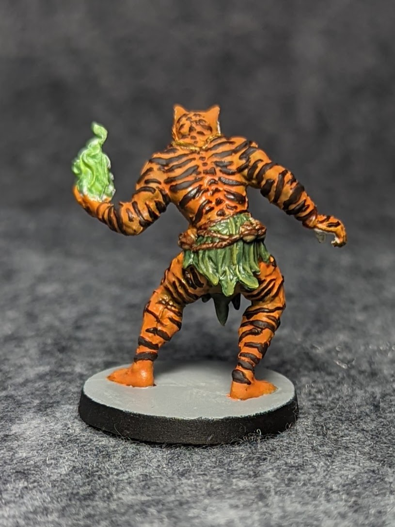
Berko the Cursed is where I started painting, and this was hands down the worst experience of the set. Looking at the card art, I was concerned about the care it would take to freehand the tiger stripes. Looking at the sculpt, I was shocked to see that the stripes are actually molded into the figure. This has the effect of making it look striped while unpainted, which is kind of nice for non-painters I suppose, but painted, it just looks goofy. Tigers' stripes are not raised. Further, because they are raised, you're locked in as a painter to follow those lines even though they're not very good as tiger stripes go. It was tempting to shave them all off. Adding another layer of badness is the necklace decoration. He is leaning forward, and in the card art, his necklace decorations appropriately dangle in front of his chest. The sculpt keeps the pose but presses the decorations against his chest because they could not be easily cast any other way. It struck me as an oddly amateurish move from a company named for Cool Minis. 

Still, the idea of playing a tiger-guy is kind of neat, and everyone likes green magic flame.
Zuri (front)

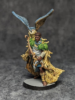
Zuri (back)

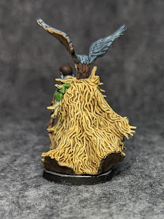
The other druid is Zuri. She was fun to paint although the twiggy cape was kind of uninteresting. I could have dressed it up with some different tones, but I decided to just take a simple approach. It wasn't until writing this that I realized the photo doesn't clearly show the nice triangle patterns on the front of her outfit, but you can see that better in the image below.

The Druid hero box comes with three animal tokens, but the Kickstarter Darkbringer pack upgrades these to miniatures. I pulled those out and included them in the set, like I did for the base set Shaman's Fire and Ice spirits.
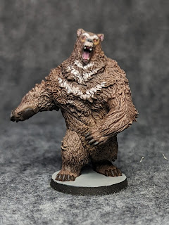
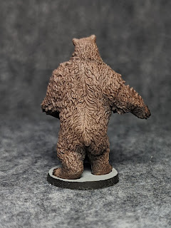
Bear (front)

Bear (back)

The bear was a pretty quick paint job inspired by Sorastro's wookie video, which I'm sure I've mentioned and linked before. I wet-blended the areas of highlight and shade, used a wash over the whole thing to bring out the shadows and merge the colors, and then did some selective drybrushing and washes to get better highlights and shadows.
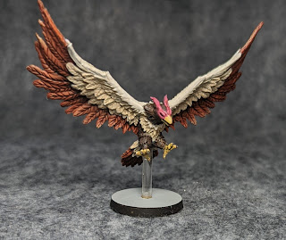
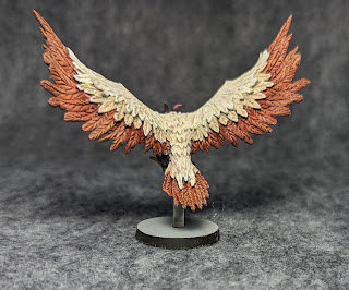
Eagle (front)

Eagle (back)

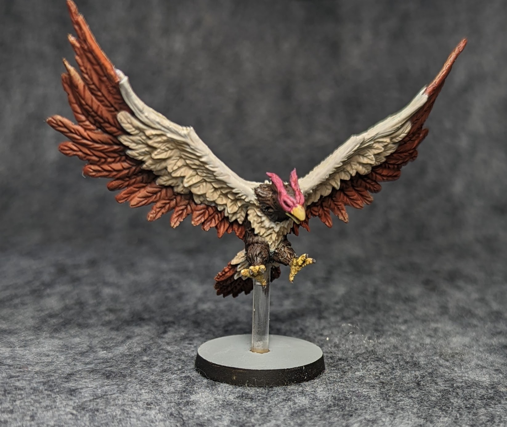
I had to start the eagle twice. The first time through, I just didn't have the right hues and contrast, and a drybrushing left it looking pretty bad. The second time through, I laid down a bit more highlights and shadows in the lighter feathers and then used a few applications of thin washes to get shadows. A few highlights were then painted in. I am sure someone could really take this model to town if they wanted to make it a show piece, but I was happy just getting it looking good on the table.
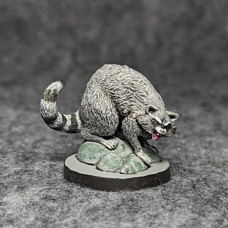
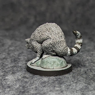
Raccoon (front)

Raccoon (back)

The raccoon was an easy and fun paint job. Once again, the great texture on the model meant I could be pretty loose with the first layer and then rely on a wash to do the work.

I realized after photographing the models separately that they are vastly different sizes, but that can be hard to tell from the close-ups. Here's a group shot of the druids and their animal forms.
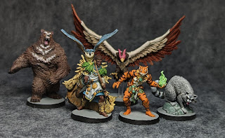
Druids and Animal Forms

Next up are the Tinkerers.

Kaylee (front)

Kaylee (back)

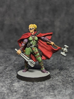
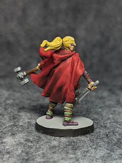
Kaylee was a pretty straightforward blonde female in a green jumpsuit with a red cloak. Honestly, I don't really like engineers in my fantasy: that feels to me less like chocolate and peanut butter and more like yogurt and pork chops. Still, the tinkerer abilities sound like fun to play. Massive Darkness was created as an excuse to chuck dice, not to compete with Tolkien, so I think it will be fine.
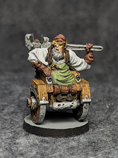
Jebediah (front)

Jebediah (rear)

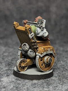
Jebediah was kind of fun to paint due to the mix of textures: not only does he have the standard skin and cloth on expects of a hero, but also wood and multiple kinds of metal. I think he turned out pretty good. I do think it's a bit goofy, though. Somehow, his rocket chair gives him extra movement points. I've only been in a few ruins, and I've never been in a dungeon Hellscape, but the ones I've seen are not very accessible. I found myself wondering how he would pick up a treasure off the floor, but I guess that's what the giant wrench is for. 

Just for fun, I'll tell you what I came up with when I asked myself, "How would I include an amputee in Massive Darkness?" My mind does not go to rocket technology and giant wrenches but rather to magic. The wheelchair is a means to an end, allowing him to move around, while also being the product of his hard work. Imagine now Jebediah as a sorcerer, levitating on a scintillating ball of magic, reaching out tendrils of otherworldly power to bash enemies and to smash open doors. He could move around the Dungeon Hellscape and impress his allies with his sorcery. I think it would make a great model to paint as well!

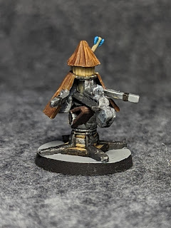
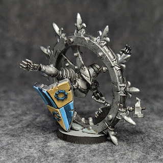
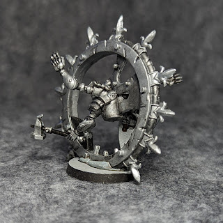
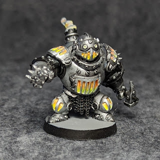
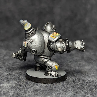
The four extra Tinkerer models were batch-painted since they used all the same colors. I started by overbrushing each one with Vallejo Model Air Steel, and I made heavy use of my P3 Armor Wash. The darker metals are Vallejo Model Air Gunmetal mixed with black. Several of them have an "inner fire" effect on the card art. I put down multiple layers of Vallejo Foundation White to get a solid background, and then I layered in VMC Yellow Fluorescent and Vallejo Mecha Color Orange Fluorescent on top of that. This and the smoke effects were inspired by Sorastro's Marvel: Crisis Protocol series, particularly the Deadpool episode. I had tried these fluorescent paints a while ago on other models and was very unhappy with them, but this time, I think they filled the bill; I am not sure what the difference was.

Like the eagle above, many of these could be real showstoppers if someone wanted to come in and do some non-metallic metals or reflective hues.
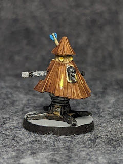
Guard (front)

Guard (back)
Sentry (front)

Sentry (back)

Guard (front)

Guard (back)

Exo-Armor (front)

Exo-Armor (back)

Here they are all together, in part to show the scale.
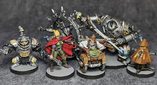
Tinkerers, Constructs, and Exo-Armor

As I was wrapping up the constructs and exo-armor, my Red Grass Games Wet Palette arrived. I backed the Kickstarter after hearing positive things about wet palettes over the years. One of the things that turned me off from them was that they seemed wasteful, but I liked that Red Grass promised a reusable membrane. Given that the two bards have almost identical color schemes, I figured this would be a good opportunity to try it out. 

I painted the bards in about four sessions across three days. After my first session, I was kind of unhappy with the palette. I had a hard time getting the right consistency from my paints: too thick is never good, but adding water made it run across the palette. I also wasn't sure how much paint to use, since my usual method of eyeballing is (perhaps more than I realized) bound up in the simple white plastic palette I use. When I decided to add a little glaze medium, my green got super runny on the palette, while the edges of it seemed completely dried out. I wondered if I didn't have enough water in the wet palette, so I added some more and put the lid on. A day later, I sat to continue the project and was amazed to find the paints still usable. Yes, some of the green had dried at the edges, but everything else was basically fresh. Some of the paints separated slightly and needed to be mixed again, but I have to say, the Red Grass palette did exactly what it said it would do.
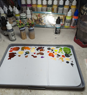
Wet Palette after having finished the bards

I think I need to look more at the technique of using the wet palette. I have a pretty good system for getting decent transitions using two-brush blending, a well palette, and glaze medium. Two-brush blending in particular seemed redundant with the wet palette, but I kept using it because it is my standard approach. The few times I have watched painters use wet palettes, they seem to spread out the blends across more physical space. I was hesitant to do this because I had very little sense of how much surface area I would need for these figures. My conclusion is that I am interested in using the wet palette again, but I think I need to have a good purpose for it: either something with complicated transitions or a time when I know I need to keep a color for more than one session.

Incidentally, I rinsed off the membrane, and while it's slightly discolored, it is still clearly reusable. There is some dried green in the corner that did not come off, but that is exactly as per the instructions: if you let the paint cure, don't expect it to be removable.

Enough exposition about technology. On to the musicians!
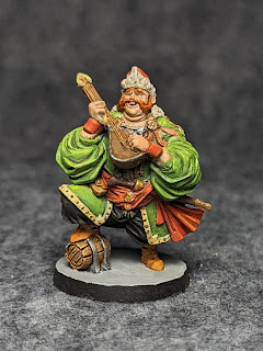
Dylan (front)

Dylan (back)

Here's Dylan, who, with a name like that, I expected to be a short, wiry, melancholic sort. It was a fun model to paint, with bright colors and interesting details. I like that he's a big guy standing on a cask: the whole model shouts personality. One of the challenges I faced is that he has his eyes closed, and I did not expect that to be such a challenge to paint. There's lots of advice for painting eyes; there's less about painting eyelids. I could have painted his eyes open of course, but I think the closed eyes, lost in the song, is a big part of the charm of this figure.
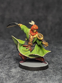
Thalia (front)

Thalia (back)

When I took Thalia out of the packing, I thought that his sword was bent. Then I wondered if perhaps he was wielding some kind of khopesh or curved sword. It wasn't until I looked at the card art that I realized that, of course, it is a bow for his violin-like instrument. This was hard to tell because only the stick is sculpted, not the hair. I got some beading wire, trimmed it to size, and super-glued it in place. This made all the difference in the world in terms of "reading" the figure. Like Dylan, I also think this is a great model: the posture implies a real dynamic motion in a way that makes poor Kaylee above look really bland. 

Thalia's card art has even more wonderful details that I chose not to paint simply so I could wrap up the bards and move on to other things. I don't imagine I'll ever come back to it, though it's tempting. That's a case where the wet palette could be useful, too: keeping the green around long enough to cover up the inevitable mistakes that come from freehanding designs over billowing fabric.

That's all for this installment of Painting Massive Darkness 2. I hope you'll come back next time for more.