Wednesday, December 30, 2015

Painting Runebound Third Edition

The second edition of Runebound was one of the earlier games I bought after starting my job at Ball State. It's a fantasy romp, with heroes trekking over a map, collecting gold, fighting monsters, and facing assorted trials. We had some good afternoons and evenings with this game before kids, and my oldest son has been able to play it with me for at least a year. There were some parts of it that were quite frustrating, however, including the facts that losing combat was devastating, allies were required but hard to come by, and healing was terribly expensive. After getting back into painting miniatures, I looked at the second edition hero figures with an eye toward painting them, but the game had become a bit stale for me. The miniatures were also on the small side and not very detailed.

Second Edition Box Art: None of those characters is actually in the game.
When I heard the announcement that there would be a new third edition, I was honestly a bit embarrassed over my giddiness. Could the designers at Fantasy Flight Games pull off a revision that keeps the good parts of the second edition but clean up the rough edges? I ordered my copy shortly after it was released, having just completed my Fury of Dracula miniatures, and I was pleased that the miniatures were much improved over the second edition's.

Third Edition Box Art: This character is also not in the game
I decided to paint the figures before playing the game, as has been my recent norm, still remembering the disappointment of painting the Legend of Drizzt miniatures (Part 1, Part 2) after already being kind of burned out on the game. I will present them here in the order they were completed. For this set, I tried to focus on increasing the contrast in my painting, particularly by increasing the level of highlights. The color schemes were all taken from the card art.


This is Corbin. There are a couple of details here that I am really happy with: the slightly brassy tint on his buckler and lower armor; the ruddy complexion; and the worn leather. This was the first figure on which I used my new Vallejo Air Metallic paints, after hearing Dr. Faust rave about how well they work off the brush. I had been using Vallejo Metallic Gold, Silver, and Gunmetal paints, so I picked up Gold, Steel, and Gun, from the Air Metallics line. Sure enough, the Steel and Gun are super smooth with fantastic flow. The gold is weird, though: it has a similar consistency, but the carrier (binder? medium? the liquid part) has a funny tint to it. Once the paint is dry, it has a good gold color, but it's kind of unpleasant to paint on because it's so far from what one would expect. This also meant it couldn't really mix well either since you cannot really tell what it would look like dry from what you have on the palette.

I put some of these pictures on Facebook, where I felt like I had to remind my non-painting friends that this little fantasy dwarf is smaller than a quarter. The pictures are much bigger than reality: looking at the real miniature, he looks better than the zoomed-in photos.

Each Runebound character has a thematic color, and Corbin's is pale green, which really only shows up on his shoulders and helmet. The grassy base helps bring it out a little bit.


Here's Laurel of Bloodwood, a vision in red and brown. I had a hard time figuring out how much to highlight the brown and red of the cloak, and I think the result is just OK. The quiver at her hip turned out nicely, all done by hand without washes. For her, and the rest of the set, I returned to my usual Gold paint. I was very nervous painting the forehead tattoo, in part because this was what I did last, several days after having done the rest of the skin. It looks OK, and it built in me some confidence for later freehand work in this set.

See the big leaves at her feet? These are from the seed pods of a white birch. I had read about how some folks use them for basing miniatures, so about a year ago, I collected many from a tree in my neighborhood, and my son and I separated out the seeds. This was the first time I actually used the on the base, together with the cork rock in order to give a sort of New England forest look.


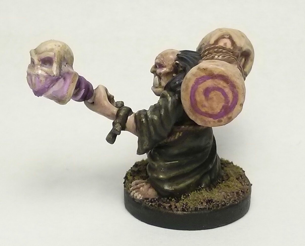
Elder Mok is one of my favorite paint jobs. I think his drum turned out quite well, looking like warn canvas. For the ends, I freehanded the game's spirit icon. I was very nervous, but I think it turned out well, although if I could do it again, I would not have given it the same orientation on each side. The purples on the skull were fun to paint, and he has a soft OSL effect on the skull and his own eyes. I am happy with the skin tone and shading here too, all done by building up layers from a shade to highlights.

This was my first piece using my new magenta paint. I have known for a while about the difference between light primaries and pigment primaries, and I like to use complementary colors to darken and mix browns, but I've only been doing it with light primaries. Magenta paint was easy to find, but Vallejo doesn't have a color called "cyan." Some hunting in the usual places told me that their Deep Sky Blue was practically cyan, so that's what I've been using—we'll see more of it in a few figures. In some of the later figures, I did do some mixing with CMY, but I found myself sticking mostly with familiar recipes.


Lyssa's background narrative describes her as "half-katjie," which I assume is some kind of cat creature. It's a great miniature except I thought the pose was a little awkward, so I added the fallen log to the base to give more context to it.

I struggled with matching her flesh tone, and she's showing so much of it that earlier mistakes could not be overlooked. I ended up doing her skin differently than most of the others: instead of building up layers, I gave her a good base coat, then I used washes to add shades, then put the highlights on top of that.

Her tattoos represent the most intricate freehand work of the set, and certainly the most intricate freehand work that I have done. I did a bit of reading ahead of time, finding the consensus to be: always mix at least some of the flesh color into the tattoo color; and start with a very faint mix to give yourself an outline, and build up from there. As with Laurel, the tattoos were the last step and I couldn't exactly remix the flesh color, but it was close enough. I was so pleased that I hadn't ruined the miniature with the tattoos that I took it downstairs to show my wife. Showing her, I realized it was still not dark enough: they were only clear under my painting lamp. Fortunately, I hadn't cleaned up yet and the paint was still wet, so one more layer did the trick.

I think her abdominal area turned out quite nice. There's hardly any texture on the model, but the paint gives her the look of powerful abs. I could not think of anything very clever to do with her claw-like right hand, so I just left it all flesh colored. It's not shown in the card art, and I didn't want to add comical fingernails that were not sculpted into the model.

After all the varnish was dry, I decided to add some static grass. My usual application method left way too much on the base--it suddenly turned from an early brown into too much green. I tried to pull the grass out with my wet paintbrush, and as a happy accident, some was left sparsely on the base. I think it looks good, like the thin but long grass in the woods.


Lord Hawthorne is the brightest of the bunch, and here is where my new "cyan" paint really shines. It provides the base color for his robes and a great contrast to the orange of his gloves, boots, and hair. His skin was done like Lyssa's, trying to match the card art's base tone, then using washes for shades followed by manual highlights. There's a light brown underneath his armor that is clearly on the card art but almost imperceptible in the photographs. Still, I am happy I spent the time to add it. It was the first layer on the upper armor, with the steel added around it, followed by P3 Armor Wash for shade.

My only regret here is that I based all the figures on the same dark brown rubble, but this guy would probably look great if he had been done on something grey, like cobblestone or shale. The rock on the base picks up some of the grey, and the brown is reflected in his belt and satchel, so it's not all bad.


The last of the set is Master Thorn, who made me wonder, "Did the designers notice that there's a Master THORN and a Lord HawTHORNe?" Perhaps I am sensitive to it because I've been reading Bone with my two older boys, and they feature a character named "Thorn" as well.

In any case, for his skin, I went back to layering, and I'm really happy with how it looks. He's a muscular old coot, and I like the shadows that accent his figure. The card art gives him a snow white beard, but I decided to make it more grey, in part to get nicer shadows and contrast. As simple a detail as it is, I am really happy with the wooden part of the staff, and it turns out this was a sort of accident: I have a size 0 brush that I rarely use because the bristles don't all line up, but it turns out it's really useful for making lines of irregular width! It sure worked well here.

The thing at the top of his staff was not very well molded, and I probably could have spent more time adding manual shadows to make it more visually interesting, but by this point I was ready to be done. In fact, twice I thought I had finished the figure, only to realize something was missing: the first time it was the strap under his left elbow (which you cannot really see in the picture) and the second it was his head tattoo. That tattoo turned out very nicely, and on this one I was able to use another trick from my research, which was to use flesh colors to subtract from the tattoo. The initial "V" shape was much thicker, but I cut away from it with very small bits of flesh tone, and the result is much more visually interesting while also matching the card art.


And there they are, all together!

But, you ask, how's the game?


My son and I played this morning, me as Laurel of Bloodwood, him as Elder Mok. As with any first-run, there were a lot of pauses to look up rules, and there were a few things I messed up. Putting that aside, we had a great time. I really like the revised adventure system, where you can choose between combat, exploration, and social adventures. The market, healing, and defeat revisions are also greatly appreciated, as they make the game smoother, more interesting, and more fun. Laurel ended up defeating Dragon Lord Margath with one health remaining, but it really was just a learning game: I look forward to playing again now that we have a better understanding of the game system.

All of the event cards present you with an option, and several of them that we faced really made us think about the decision. The most interesting one was one I faced, where Laurel saw that bandits were going to attack a village, and so I could either (a) set a trap for them and have a small chance of succeeding, ending up with a trophy, or (b) letting the bandits raid the town, then swooping in to loot what remains, which would let me take a free item from any market. The latter was obviously much better reward, given that the Twin Daggers were in a market and looked like they were designed for my character, but I found myself really torn: do I do the evil thing and get rewards, or the "right" thing and maybe get nothing? Well, we decided that it wasn't me doing these things, it was Laurel, and she was an angry and bitter elf. I got the Daggers, and later on I killed the Dragon High Lord using them. It's a good story, and it's not the kind of thing we ever had happen in second edition.

Combat Tokens: Image from FFG
I like the token-tossing combat more than I thought I would. It was previously unfamiliar to me, but I wonder if we'll some other designers picking it up and running with it. At first, I thought it would just be a weaker version of dice, but the chips can do one thing much better than dice: unambiguously flip over. The fact that the chips show what's on their reverse side is clever and leads to some fun tactical considerations. Second edition combat was mostly an exercise in repeated dice rolling; the only real significant decision was which character would take the blow. This did lead to some very funny cases of throwing allies under the bus, but it was mostly tedious.

There's also an aesthetic to tossing the tokens that I cannot quite place, how they fall and roll in a way quite different from dice. I'm still unsure how this makes up for the fact that "rolling" them in your had is a little tricky. I am also a little worried about the chips getting dinged up, but I see FFG is selling spare sets for just $5. We have only played once, but I certainly like them better than the second edition's dice so far.

Winter break has been a great opportunity for me to catch up one some blogging and some painting, but it has also been very productive for my current research project. In fact, this afternoon I closed the last issue in the "finish before the new year" milestone on GitHub. Come to think of it, I haven't blogged about that project at all, nor Spring's upcoming immersive learning class. The next week and half will involve a lot of planning for the next semester, so perhaps I will find some time to share those stories in the coming days.

Tuesday, December 22, 2015

Painting Fury of Dracula

I had been aware of Fury of Dracula as a hard-to-find hidden movement game, and when I watched the Shut Up & Sit Down Review of Specter Ops, I was sure we'd see another printing. I have seen SU&SD reviews drive common retailers out of stock on hot games more than once, and so if Paul Dean opines about its elegance and beauty, Fantasy Flight would be fools not to reprint it.

I picked up a copy of the third edition from my FLGS, Wizard's Keep, and got to painting. The miniatures are decent but not great. With this set, I tried to be more deliberate about contrast. Regular readers may remember my work on the heroes of Shadows of Brimstone, particularly the Marshal, where I added another highlight layer after I thought I was done, and that really made the model pop.


Lord Godalming was the first out of the gate. I had some fun with his lantern, doing the OSL in a slightly different style than before. Instead of painting the whole figure normally and then trying to add the lights, I built up highlights around where the lantern shines, and then tinted and brightened at the end with a series of glazes. It worked well, and I am happier with this than my last attempt. After having played the game, I realized I could have taken the lantern light up much brighter: it looks OK in this close-up, but on the table, it doesn't register.


Next is Van Helsing, looking dapper in his spats. I'll point out how much brighter I took the highlights on his face than I normally do, an effect that I think works well on him.


Mina Harker was fairly plain in her black dress: a few layers of dark grey, and that was done. The scarf probably could have been brighter, just for more visual interest, although the faded orange matches the card art fairly well.


Here's Dracula himself, looking ... well, maybe not so good. The card art depicts him with grey, lifeless skin. I think I captured that here, like his dark purple suit. Once again, it matches the card art, but it's not much to look at. I'm unsure whether I would have been better off diverging from the card art, increasing the contrast of the highlights, brightening up the tone, or what. It's not like he's a dark menace on the game board, since figures like Mina Harker are practically as dark as he is. I'm no sculptor, but I would have gone for a more regal or powerful vampire sculpture rather than the almost comical monster-movie mouth-agape pose.


Last is Dr. John Seward, another hero in a monochromatic scheme. These gothic characters like their dark tones. The subtly different shades on his cloak, vest, and coat are nice in the picture, but on the table it's hard to tell it's there.

So far, I've only played once, and we had one critical rule backward. The heroes have turns called "day" and "night", and between these are "dawn" and "dusk." Combat happens between day and night, but several of Dracula's cards change behavior depending on whether it is night or not. That's a serious design problem, because there's already a thing called "night", and combat doesn't happen then. Does dusk count as day or night? We made a judgement call and got it backward: dawn counts as night, but dusk counts as day. Anyway, the result is that once they heroes got on my trail, it was just a matter of chasing me down and beating me up---I really had no way out, not without better combat cards. I'm eager to play again, especially with the advanced rules. For the heroes, the only difference is that they pick their starting cities, but Dracula gets a host of new powers with the Advanced rules, including several I could have used to get out of my jam earlier. (I was cornered in Eastern Europe with nowhere to go, but Wolf Form would have let me pass through a hero into Central Europe, where I would have more options.)

The figures were fun to paint despite the fairly low detail of the scultps, at least compared to other stuff I've been working on. I'm currently painting the heroes from the new Runebound edition, and so these are also boardgame-quality miniatures, but they are much nicer. It wasn't clear that painting the Fury of Dracula miniatures was worth it from an aesthetic point-of-view: they felt abstract to me, in a different way than the painted Ashardalon figures really bring the dungeon to life. Whether it's because of the game rules, or the fact I was Dracula, or the drab colors, I am not sure. Anyway, if you want to come by and play, let me know—I'd love to give it another play, but I get the sense that you really need exactly five players to get the full experience.

Monday, December 21, 2015

What we learned in CS222, Fall 2015 edition

Another semester, another "What We Learned" post!

Once again, my CS222 students made lists of what they learned in the past semester and voted on the most important items. I taught two sections, and their top items are similar; I'm listing the item as well as the vote count.

10AM Section:

  • Single Responsibility Principle (9)
  • Test-Driven Development (9)
  • Team development (6)
  • Refactoring (6)
  • GitHub (6)


Noon Section:
  • Learning from failure (13)
  • Clean Code (11)
  • Single Responsibility Principle (8)
  • Test-Driven Development (8)
  • Group programming  / team-oriented development*
* There's no vote count on this item because these two were combined after voting.

"Failure" came up as an item in the 10AM section, but it received few votes. Someone in the noon section articulated the same phenomenon as "Learning from Failure," and it got the most votes of any single item. Indeed, learning from failure came up in many final essays from both sections, and it is always a strong theme in the course.

Another interesting note about the final exam: for the first time, I heard about a student who read my blog to try to figure out what to expect on the final.

As I wrote about earlier, I introduced a few changes this semester. One of the most significant was that I replaced the overall grading scheme: previously, I took a grade as a maximum across several categories, but I switched to a model where everything contributed. I like the philosophy of the max-based grading: you're only as strong as your weakest category. However, this did cause students to lose heart when they fell behind in one category, after having spent a lot of effort on a different. This semester I used a more conventional scheme, like this:
  • Final Project (50%)
  • Final Exam (5%)
  • Assignments (25%)
  • Achievements (20%)
Those numbers are not arbitrary: I based them off of imaginary worst-case scenarios. (It may be helpful for this discussion to remember that I am using triage grading, not the arbitrary historical accident that is the 90=A, 80=B, etc..) If a student did everything perfectly except achievements, they would earn at most a B. Similarly, no assignments results in a max of B-, and no final project is D+. I didn't perceive the problem of student frustration as with the max-based system, but I still feel uneasy about this other model. I'm not sure how to combine the two models except with something more like contract-based grading. That is, I could set up a series of rules, such as capping the grade at B+ if you do no achievements, or capping the grade at D if you do not get satisfactory scores on each assignment.

The switch to GitHub went fairly well, although I am sure I can clean up a few loose ends. I plan to record a few extra instructional videos about recommended workflows as well as how to deal with merge conflicts. It was definitely less flaky than using our departmental-hosted Redmine server, and the difference between git and Mercurial was nominal for the students. I still prefer the Mercurial command line, but I am growing accustomed to git's, and I've come to really like the ease of interactive rebasing to clean project history.

Since I have been using IntelliJ IDEA Community Edition in my personal work since summer, I am seriously considering having students use this instead of Eclipse in the Spring. They barely know Eclipse coming out of the prerequisite course, so I am not too worried about cognitive load. This will make it easier for students to pick up Android Studio if they want to, and I really prefer the git integrations of IntelliJ. The only real downside is that IntelliJ's compiler warning reporting is much easier to overlook compared to Eclipse's, and it's already hard to get students to recognize that these warnings need to be addressed.

I have been using a model of assignments inspired by mastery learning: I give three assignments—one during each of the first three weeks of the semester—and students can resubmit them up to once per week until they get full marks. Again, I like the philosophy of this model, but the execution is still troublesome. The problem is not so much in the submission/resubmission policy but in the breadth of the assignments. Each has a similar form: go find some source code and apply a subset of Clean Code rules to it. I think what's happening is that stronger students already have the ability to read a difficult text, parse it out into manageable pieces, and then apply those pieces to a new context. They usually get it wrong here and there, and with some guidance, show that they have learned it. The academically weaker students struggle in many more ways, though: in addition to the inherent difficulty of the material, they also have difficulty reading complex texts, analyzing artifacts, and having a sense of focus. It has made me wonder if I should move to portfolios instead of assignments. That is, rather than proverbially throw students into the deep end to sort out Clean Code rules, what if I made a list of criteria, such as, "Refactor a variable name" and "Refactor to extract smaller methods from a long method." This could potentially help scaffold the weaker students: they would have these criteria at the time of reading Clean Code, and this could help guide their attention. When they are looking at code, they would not have to try to remember all the relevant Clean Code rules in their heads, but could instead look just for items that matched the criteria. 

I am excited about the idea of portfolios in CS222, but there is no clear best technological platform to support this. I am tempted to try to do it on GitHub using MarkDown since that would eliminate any problems with students using bad document formatting. I am leaning toward a solution like what I use for achievement submissions: make a form on Google Drive that sends data to a spreadsheet that students can see, with students submitting links to portfolio documents; record my evaluations in that sheet; use a pivot table to summarize how many "portfolio points" a student has earned. This would be completely outside of Blackboard, so I would have to copy the scores at the end of the semester, and students would have to go to the sheet to see their current tally, but I think these are fairly small costs.

I didn't do quite as much blogging this past semester as I had hoped to, but I am happy with the other work I got done. I have not made the opportunity to write about how I got involved in the Interactive Learning Space initiative, but suffice it to say that I'll be able to teach CS222 in an interesting new space in the Spring. The room has easily movable chairs and tables, multiple projection surfaces, and—really strange for my building—natural light!

That's it for this end-of-semester report. I'm still having a lot of fun with CS222, a course that is working really well despite my constant tweaking.